Aug 04, 2025·8 min
Reusable screens for business apps: the 12-screen blueprint
Reusable screens for business apps in a practical 12-screen blueprint covering auth, roles, settings, billing, audit/help, and errors.
Why most business apps take longer than they should
A lot of business apps sound simple: “users log in, add records, and export a report.” The time sink is everything around that core idea. Teams rebuild the same basic screens again and again, each time making slightly different choices.
The slowdown usually comes from repetition. One person designs a login screen, another builds a second version for the admin area, and a third adds a “forgot password” flow that behaves differently. The same thing happens with settings, roles, billing, help, and error states. Every repeat adds extra QA, more edge cases, and small UI differences that confuse users.
Those repeated screens also create bugs that are hard to spot early. A permissions screen might let you assign a role, but an “invite user” screen forgets to enforce the same rule. A billing screen might show limits, but an upload form doesn’t explain why the user hit a cap. The app works, but it feels messy.
A reusable screen blueprint is a shared set of default screens most business apps need, with clear behaviors and content rules. Instead of starting from a blank page, you start from proven building blocks and only tweak what’s truly unique.
This is for founders, small teams, and product owners who want to ship faster without cutting corners. If you build with a chat-first tool such as Koder.ai, a blueprint like this also makes it easier to write clear prompts and get consistent results across the product.
What makes a screen truly reusable
A reusable screen is bigger than a reusable component. A component is a piece (a button, a table, a modal). A reusable screen is a complete page that solves the same job in many apps, like “Manage users” or “Billing.” It has a clear purpose, a familiar layout, and predictable states.
To make a screen reusable, standardize the parts people shouldn’t have to relearn:
- Layout and navigation (page title, primary actions, where “Back” goes)
- Copy tone and labels (short, plain language that stays consistent)
- States (loading, empty, success, error, and “no access”)
At the same time, keep the parts that vary flexible. A Settings screen can share the same structure while the fields differ by product. A Roles screen can keep the same pattern (role list plus a permission matrix) while the actual permissions change by domain. Billing needs room for different plans, usage limits, taxes, and currencies. Branding should be swappable without rewriting the screen.
This is why a 12-screen blueprint works well: you describe each screen once, then adapt it to a real app (like a small CRM) with just a few changes to fields, roles, and plan rules.
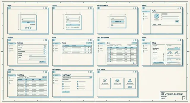
The 12 reusable screens at a glance
If you keep a set of screens ready to copy, new products stop feeling like you’re starting from zero. The trick is to treat these screens as one connected path, not separate tasks.
A simple journey looks like this: a new user signs up and logs in, completes a short onboarding step, updates their profile, invites teammates, sets roles, adjusts settings, then (if the app is paid) picks a plan and watches usage. When something looks off, they check the audit log or open help.
| Screen | MVP? | Minimum data it needs to function |
|---|---|---|
| 1) Log in | Required | Email/username, password, session/token |
| 2) Sign up | Required | Email, password, acceptance of terms flag |
| 3) Password reset | Required | Email, reset token, new password |
| 4) Onboarding (first run) | Required | Org/workspace name, default preferences |
| 5) Profile | Required | Display name, email, optional avatar |
| 6) Team members | Optional | User list, invite email, status (pending/active) |
| 7) Roles and permissions | Optional | Role names, permission set, user-role mapping |
| 8) Settings (app/org) | Required | Current settings values, save/update endpoint |
| 9) Billing and plan | Optional (Required if paid) | Current plan, price, payment method status |
| 10) Usage and limits | Optional (Required if limited) | Usage counters, limit thresholds, reset date |
| 11) Audit log | Optional | Event list (who/what/when), basic filters |
| 12) Help and support | Optional | FAQ items, contact method, ticket/message fields |
Even in a tiny MVP, decide early which ones you’ll ship. If you’re multi-user, you usually need Team plus Roles. If you charge money, you need Billing. If you enforce caps, you need Usage. Everything else can start simple and grow later.
Auth screens: login, sign up, password reset
Auth is the first trust moment. If it feels confusing or unsafe, people leave before they see your product.
Login screen essentials
Keep the page simple: email (or username), password, and one clear button. Add small upgrades that reduce support tickets without adding clutter.
If you only add a few extras, make them these: a “show password” toggle, clear error text for wrong credentials, and a short security note like “We will never ask for your password by email.” Use “Remember me” only if the app is mostly used on personal devices. Add SSO only if you can support it well.
Sign up should match how you sell. Public products can use open sign up with an email verification note. Team tools often work better as invite-only, with a simple message like “Ask your admin for an invite” instead of a dead end.
Password reset flows should be safe and predictable. Use messages that don’t confirm whether an email exists, such as: “If an account matches that email, we sent a reset link.” Keep steps short: request, email, new password, success.
For lockout or suspicious activity, stay helpful and calm. After too many attempts, “Try again in 15 minutes or reset your password” is usually enough. If you detect a risky sign-in, prompt a quick verification step and explain what happened in one sentence.
Onboarding and profile basics
Onboarding is where people decide if your app feels simple or tiring. Keep first run short: show a welcome, ask only for what’s required to start, and make “skip for now” obvious when a step is optional. If something is required (like accepting terms or choosing a workspace), say so in plain words.
A useful rule: separate “getting started” from “making it perfect.” Let users start working fast, then nudge them later to fill in nice-to-have details.
First-run onboarding that doesn’t annoy people
Aim for a small set of steps that fit on one screen each. For most apps, that means:
- Create or choose a workspace (if the app supports multiple teams)
- Set timezone and language so dates and emails make sense
- Confirm email if it affects security or invites
- Offer import or teammate invites as optional, skippable steps
Profile basics people actually use
The profile screen should cover personal info (name, email), avatar, timezone, and language. Put “change password” and “sessions/devices” near other security items so users can find them without hunting.
If your product supports multiple workspaces, add a clear team switcher in the top bar and also inside the profile or settings. People should always know where they are and how to switch.
Be intentional about logout and session timeout. Place logout where users expect it (a profile menu is common). When a session expires, explain what happened and what to do next. “You were signed out due to inactivity. Please log in again.” beats a silent redirect.
Roles, permissions, and user management
Go from blueprint to app
Turn your screen blueprint into a working React app with a Go backend and PostgreSQL.
A lot of “security” problems are really UI problems. If people can’t see who can do what, they guess. A reusable roles-and-users area removes that guesswork and fits almost any team app.
Start with a Roles screen that shows a simple role list (Owner, Admin, Member, Viewer) and short descriptions in plain words. Pair it with a permissions matrix where rows are actions (for example: “view records”, “export”, “manage billing”, “delete workspace”) and columns are roles. Keep it readable: use checkmarks, group actions into a few categories, and add small tooltips only where needed.
User management should feel like an inbox, not a database table. It needs a clear status badge for each person (Active, Invited, Pending approval, Suspended) and fast actions: invite by email with a role, resend invite, change role (with confirmation), remove user (with “what happens to their data?” text), and a “last active” date for quick auditing.
If you need access requests, keep it lightweight: a “Request access” button, a short reason field, and an approvals queue for admins.
Guardrails matter. Only Owners should change billing-related permissions, delete the workspace, or transfer ownership. When someone tries, show a clear reason and the exact role (or person) that can do it.
Settings that stay sane as the app grows
Settings screens tend to become a junk drawer. The fix is a settings hub with a stable layout: left navigation with consistent categories, and a right panel that changes based on the selection.
A simple rule helps: if someone will change it more than once, it belongs in Settings. If it’s part of first-time setup, keep it in onboarding.
Use a predictable settings hub
Keep the menu short and worded like actions people recognize. For most business apps, a handful of categories covers almost everything: Profile and preferences, Notifications, Security, Organization (or Workspace), and Integrations (only if you actually have them).
Don’t hide core items under clever names. “Organization” beats “Workspace DNA.”
Settings areas that pay off early
Notifications work best when they’re split by channel (email vs in-app) and importance. Let users choose frequency for non-critical updates, but keep critical alerts clearly labeled and hard to miss.
Security settings are where trust is won. Include 2FA if you can support it, plus a list of active sessions so users can sign out of other devices. If your audience works on shared computers, “last active” and device info help.
Organization settings should cover what admins reach for first: org name, branding basics (logo/colors), and a default role for new invites.
In a small CRM, sales reps change notification frequency and timezone, while an admin updates the company name and default role. Keeping those in predictable places prevents support tickets later.
Billing, plans, and usage limits
Billing is where trust is won or lost. People don’t mind paying, but they hate surprises. Treat billing as a small set of screens that always answer the same questions.
Start with a Billing overview that’s boring in the best way: current plan name, renewal date, payment method, invoice history, and the billing email used for receipts. Make “edit payment method” obvious.
Next, add a Plan compare view. Spell out limits in plain language (seats, projects, storage, API calls, whatever fits your app) and be direct about what happens when someone hits a limit. Avoid vague labels like “fair use.”
A separate Usage and limits screen prevents support tickets. A few meters and clear messages before the user is blocked usually do the job. If you include actions, keep it simple: one upgrade button, and a note that only admins can change the plan.
Treat cancellation and downgrade as a flow, not a single button. Explain what changes, add a confirmation step, and send a final “billing changed” message.
Example: a 3-person CRM might allow 1 pipeline on Free and 5 on Pro. When a team tries to add pipeline #2, show the limit, what they can do instead, and an upgrade path rather than a dead end.
Audit, help, and support screens
Extend the app to mobile
Create a Flutter mobile companion that matches your web screens and permissions.
Treat audit, help, and support as first-class screens, not add-ons. They reduce trust issues, shorten support threads, and make admin work calmer.
Audit log screen
An audit log answers three questions fast: who did what, when, and (if you track it) from where. Focus on the events that change data or access. A solid starting set includes sign-in activity, password changes, role or permission changes, create/update/delete of key records, billing events (plan change, payment failure), usage limit hits, and exports.
Keep it readable: a clear event name, actor, target (record), timestamp, and a short details drawer. Add basic filters (date range, user, event type, workspace/project). Export can be simple: a CSV export with the current filters is enough for most teams.
Help center and support
Your help screen should work even when people are stressed. Include a small FAQ list, a contact option, and a short status note (known issues or planned maintenance). Keep the language plain and action-based.
For “Report a problem,” ask for what support always needs: what they expected vs what happened, steps to reproduce, screenshot or recording, device/browser and app version, time it happened, and any error message. After submitting, show a confirmation that summarizes what was captured and how to follow up.
Error, empty, and loading states you can’t skip
Most teams think about error and empty screens at the end, then spend days patching holes. Treat these states as shared patterns and you’ll ship faster with fewer support tickets.
Errors users will actually see
A global error page should be polite and useful: say what happened in plain words, offer a clear next step (Retry), and give a way to reach support. Keep technical details like request IDs behind a small “More details” area.
Inline errors matter even more. Put messages next to the field that needs fixing, and keep the tone neutral. “Email doesn’t look right” works better than “Invalid input.” If a form fails after submit, keep what the user typed and highlight the first issue.
Empty, loading, and offline states
Empty states aren’t blank screens. They should answer: what is this page for, and what can I do now? For example: “No invoices yet. Create your first invoice to start tracking payments.” Add one clear call to action.
Loading states should match the wait. Use a spinner for quick actions, and skeletons for longer page loads so users can see the layout is coming.
If the app is offline, say so clearly, show what still works (like viewing cached data), and confirm when the network returns.
How to use this blueprint to speed up a new build (step by step)
Speed comes from deciding the common screens first, before you get pulled into domain details. When teams align on these basics early, the first usable version shows up weeks earlier.
A simple 5-step workflow
- Start with a screen inventory and roles. List who uses the app (admin, manager, member, read-only, billing owner) and what each person must do on day one.
- Copy the 12-screen skeleton and rename it for your domain. “Users” becomes “Agents”, “Projects” becomes “Deals”, “Workspace” becomes “Clinic”, and so on. Keep the structure so you don’t redesign the basics every time.
- Define the data contract for each screen. For every screen, list inputs (forms, filters), outputs (tables, cards), and rules (required fields, validations, visibility by role).
- Write plan limits and key error text early. Decide what happens when someone hits a cap, lacks permission, or needs billing access. Draft the exact messages and the next action (upgrade, request access, retry, contact support).
- Test the full journey with a demo account. Use one account per role and click end-to-end: sign up, onboarding, create one real record, invite a user, hit a limit, check audit/help, and recover from an error.
Example: if you’re building a small CRM, create a “Sales Rep” demo user that can add contacts but can’t export data. Make sure the UI explains why exporting is blocked and where to go next.
Common traps that slow teams down
Launch without extra setup
Deploy and host your app with support for custom domains when you are ready to launch.
Most delays don’t come from hard coding. They come from decisions that were left vague until the UI was already built. If this blueprint is going to save time, you need a few agreements early.
Teams often hit the same potholes:
- Designing screens before locking roles and plan limits, then rebuilding flows when access rules change or features need to be paywalled.
- Spreading important settings across too many pages, so no one can find basics like notifications, security, or data export.
- Creating too many roles with fuzzy names (Owner, Super Admin, Admin+, Power User), which turns every permission decision into a debate.
- Leaving empty, loading, and error states for “later,” then shipping a product that looks broken when there’s no data or a request fails.
- Mixing admin controls and end-user preferences, so regular users see scary options and admins waste time hunting.
A simple rule helps: decide what happens when a user has no data, no access, no internet, or no credits before you polish the happy path.
Example: in a CRM, agree up front that Sales can edit only their own deals, Managers can view team reports, and Owners control billing. Then split settings into “My profile” vs “Workspace admin,” and your billing screens can show clear limit messages instead of surprise errors.
If you’re building in Koder.ai, writing these rules in Planning Mode first can prevent rework when generating the screens.
Quick checklist before you call it MVP-ready
Before you ship, do a quick walk-through like a first-time customer. Click only what the UI offers. If you need a hidden URL, a database tweak, or “ask an admin” to proceed, your MVP isn’t ready.
Use this checklist to catch the common gaps this blueprint is meant to prevent:
- Can you reach every core screen from a clear path (menu, profile menu, or an obvious button), including “boring” ones like billing, help, and audit?
- Do all forms behave like real products: clear field errors, a success confirmation, and a helpful failure message that says what to do next?
- Are plan and usage limits visible early (on the upgrade page, in settings, and near the action), not only after a user hits a wall?
- Are admin-only actions labeled in plain words and also protected by permissions (UI hiding isn’t security)?
- Do you have complete unhappy paths: empty states, loading states, and error screens that keep users moving?
A simple test: create a new account, then try to add a second user, change a role, and export data. If you can do all of that without confusion, your navigation and permissions are probably solid.
Example: applying the 12 screens to a simple CRM app
Picture a small CRM for a local services company. It tracks leads, contacts, and deals, and it has three roles: Owner, Sales, and Support.
Day 1 usually needs the same shared screens, even if the data model is simple:
- Auth: login, sign up, and password reset so new hires can get in without admin help.
- Onboarding and profile: a short “Company name plus timezone” step, then a profile screen to set name and notification preferences.
- Users and roles: invite users, a members list, and a role editor (Owner manages billing and roles, Sales edits deals, Support views and comments).
- Settings: company settings (pipeline stages, email templates), plus personal settings (theme, notifications).
- Billing and limits: a plans page and a usage screen that shows seats and contact count.
A realistic plan rule: the Pro plan allows 5 seats and 2,000 contacts. When the Owner tries to invite a 6th user, show a clear limit state, not a vague error:
“Seat limit reached (5/5). Upgrade your plan or remove a member to invite Alex.”
Common error scenario: Sales tries to delete a contact, but Support has an open ticket linked to that contact. Block the action and explain what to do next:
“Cannot delete contact. This contact is linked to 2 open support tickets. Close the tickets or reassign them, then try again.”
If you’re implementing this blueprint with a chat-based builder, consistency matters as much as speed. Koder.ai (koder.ai) is designed for generating web, backend, and mobile apps from chat, and it supports Planning Mode and source code export, which pairs well with defining these screen patterns before you start generating pages.
FAQ
What is a reusable screen blueprint, and why does it speed things up?
Start with a reusable screen blueprint because most delays come from rebuilding the same “boring” pages (auth, settings, billing, roles) in slightly different ways. A shared default keeps behaviors consistent and reduces QA time, edge cases, and user confusion.
How is a reusable screen different from a reusable component?
A component is a small UI piece like a button or table. A reusable screen is a full page with a clear job, predictable layout, and standardized states like loading, empty, and error, so users don’t have to relearn the basics across your app.
Which of the 12 screens should I build first for an MVP?
A practical MVP set is Log in, Sign up, Password reset, Onboarding, Profile, and Settings. Add Team members and Roles if the app is multi-user, Billing if you charge, and Usage if you enforce limits.
What should a good login screen include (without overcomplicating it)?
Keep login simple: email/username, password, and one clear action. Add a show-password toggle and clear error messages, and avoid extra options unless you truly support them well.
How do I make password reset secure without frustrating users?
Use a neutral message that doesn’t confirm whether an email exists, like “If an account matches that email, we sent a reset link.” Keep the flow short: request, email link, set new password, success confirmation.
What’s the simplest onboarding that still feels professional?
Ask only what’s required to start using the app, and make optional steps easy to skip. Separate “start working” from “make it perfect” so users can do real work quickly and fill in details later.
How do I design roles and permissions without creating a mess?
Start with a small, familiar set (Owner, Admin, Member, Viewer) and explain each role in plain language. Use a readable permissions matrix and keep critical actions like billing and ownership transfer restricted to Owners.
What should a “Team members” screen include to reduce admin confusion?
Treat it like an inbox: clear status badges (Invited, Active, Suspended), fast actions (resend invite, change role, remove user), and helpful context like “last active.” When blocking an action, say why and who can do it instead.
How do I keep Settings from turning into a junk drawer?
Use a stable settings hub with a left-side category menu and a right-side details panel. Keep categories obvious (Profile, Notifications, Security, Organization) and avoid scattering important items across random pages.
What makes billing and usage screens feel trustworthy to users?
Show plan, renewal date, payment method status, invoices, and billing email in a simple overview. Make limits explicit and explain what happens when a limit is hit, then pair that with a usage screen that warns before users get blocked.