Aug 03, 2025·8 min
Salon & Barber Booking Websites: Layouts and Flows That Convert
Learn the best salon and barber website layouts and booking flows—what to place above the fold, how to reduce steps, and how to boost completed bookings.
Learn the best salon and barber website layouts and booking flows—what to place above the fold, how to reduce steps, and how to boost completed bookings.
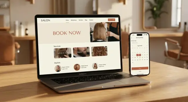
A booking website succeeds when a new visitor can understand what you offer, what it costs, and how to lock in a time—almost immediately. You don’t get a long attention window. In under 10 seconds, a good booking site should answer four questions:
Clicks and time-on-site don’t pay the rent—appointments do. A high-performing salon booking website or barber booking website reduces decision fatigue and keeps momentum: pick a service, pick a provider (or “first available”), pick a time, confirm. Anything that slows that sequence (hidden pricing, too many choices at once, unclear durations) lowers completion rates.
Not everyone is ready to book right away. Your site should also make it effortless to:
These support actions protect revenue you’d otherwise lose to hesitation.
Most drop-offs come from avoidable friction:
Success is a booking flow that feels fair, clear, and fast.
A high-converting salon or barbershop site keeps decisions simple. Visitors should instantly see what you offer, who they’ll book with, and how to lock in a time—without hunting.
Keep the main nav short and predictable:
If you can’t fit everything, prioritize Services, Team, Locations, Contact and place Gift Cards in the header as a secondary link.
Your first screen should do three things:
Avoid competing buttons like “Learn More” and “Call” at equal weight. Make booking the default path.
Pick one label and use it everywhere: “Book now” (recommended) or “Book appointment.” Don’t switch between variations across pages; small inconsistencies create hesitation.
On mobile, add a sticky “Book now” button that stays visible as users scroll. Make sure it doesn’t cover key content (like prices, service descriptions, or the map) and leaves enough space for cookie banners or chat widgets.
Above the fold is your decision zone. In a few seconds, people should understand (1) you’re the right place, and (2) booking is easy.
Keep it to one sentence that names your audience and the outcome. Then add 1–2 specialties so people self-select quickly.
Examples:
Avoid vague lines like “Welcome to our salon.” Say what you do and for whom.
Your primary button should be unmistakable: Book Now.
On mobile, add a secondary Call option (as a smaller button or link). Some clients will always prefer to confirm by phone—especially for corrections, weddings, or first-time visits.
If your system can confidently show it, a small line under the CTA can reduce hesitation:
Don’t guess. Wrong availability erodes trust and leads to abandoned bookings.
Use one compact row of proof points—only what’s true and current:
Keep these lightweight so the page still feels like a fast path to booking, not a brochure.
A service menu page is where most booking friction starts: unclear names, missing prices, and “How long will this take?” uncertainty. The goal is simple—help someone recognize their service in seconds, understand the commitment, and start booking without hunting.
Organize your menu into plain-language buckets like Haircut, Beard, Color, and Kids. Avoid clever internal names (“Signature Refresh”) unless you pair them with a clear label (“Signature Refresh (Haircut + Wash)”). If you offer both salon and barbershop services, keep categories consistent so returning clients can scan fast.
Every service card should show a starting price and a typical duration (e.g., “from $35 • ~30 min”). “From” protects you when the final total varies, while duration sets expectations and reduces back-and-forth.
If you need nuance, add one short line beneath (e.g., “Price varies by length/thickness”). Keep it brief; long descriptions slow decisions.
Add-ons work best when they’re optional and scannable—think checkboxes during booking or a tidy “Popular add-ons” row on the service card. Examples: shampoo, hot towel, hair design, deep conditioning. Avoid stacking too many options on the menu page; clients should choose the core service first.
Each service card should have a clear action like Book this that jumps straight into the booking flow with that service pre-selected. If you also offer help choosing, add a secondary link like “Not sure? See FAQs” pointing to /faq, but keep the primary path focused on booking.
A great profile answers one question quickly: “Is this the right person for what I want?” If visitors have to guess, they bounce—or book at random and feel less confident.
Start with clear, current photos. One friendly headshot builds trust; 2–4 examples of real work build confidence (cuts, fades, color, textured hair, beard shaping—whatever you actually offer). Keep images consistent in lighting and framing so comparisons feel fair.
Add specialties and the types of clients each stylist/barber serves. This helps people self-select without feeling judged. Examples: “short fades + line-ups,” “curly hair shaping,” “blonde color maintenance,” “kids’ cuts,” “low-maintenance bobs,” “beard design.”
Keep bios short—think 2–4 sentences. Include tone and approach (“detail-focused,” “quick and efficient,” “consultation-first”), not a full career history. Highlight certifications only if they’re verifiable and meaningful to clients (for example, licensed barber, certified color specialist). If you can’t confirm it, don’t feature it.
Showing a schedule or “next available” can reduce hesitation, but only if it stays accurate. Out-of-date availability hurts trust faster than having none.
A simple pattern:
Give two clear options on every profile:
This supports both decision styles without adding extra steps—and helps more visitors commit to an appointment.
A booking flow should feel like a short, predictable checklist—not a form marathon. The highest-converting flows keep choices clear, reduce unnecessary decisions, and let people fix mistakes without starting over.
Service: Start with what the client wants (e.g., “Men’s Cut,” “Root Touch-Up”). Keep names plain, show duration, and display the starting price.
Staff (optional): Let clients pick a stylist/barber or choose “No preference.”
Time: Show the next few available slots immediately. If someone changes service or staff, refresh times without kicking them back to step one.
Details: Ask only what you need to complete the appointment: name + mobile/email. Save extra questions (“How did you hear about us?”) for after confirmation.
Confirm: Summarize everything in one place (service, staff, date/time, price range, location, policy highlights). Then confirm with one primary button.
This matches how people decide: service → (optional) person → time → finish.
The calendar step is where many “almost bookings” die. Your goal is to make choosing a time feel quick: clear options, minimal scrolling, no surprises.
Use a date/time picker designed for thumbs: big tap targets, clear contrast, and no precision tapping. If someone needs to pinch-zoom to hit a time slot, they’ll abandon.
Keep the interface focused: show the next available days first, and let people expand to later weeks only if needed. If you offer durations (e.g., 30/45/60 minutes), show them before the time grid so the available slots update instantly.
Avoid empty calendars that look broken or fully booked. Instead:
If you have multiple branches, the time selector must repeat the chosen location (and staff member, if selected) in a sticky summary. Include the address preview so clients don’t book the right time at the wrong shop.
For time zones, be explicit: “All times shown in Pacific Time (Los Angeles).” This matters for tourists and remote gift-booking.
After a slot is chosen, the confirmation page should reduce second-guessing:
Easy rescheduling prevents no-shows while keeping the booking completed today.
This is where many bookings stall: the form suddenly feels like paperwork, and policies appear too late. The fix is simple—ask for less, explain more, and surface money rules before the final click.
Keep the required fields to the minimum:
If you need both phone and email, make one optional or explain the tradeoff clearly. Every extra required field increases abandonment—especially on mobile.
A short line under the field reduces hesitation and bad data:
Phone number (for appointment updates and last‑minute changes—no marketing texts)
That one sentence prevents fake numbers and reassures clients who don’t want spam.
Don’t hide deposits, cancellation windows, or late policies in a footer link. Show them right above the “Confirm booking” button so the client sees the rules before committing.
Keep it scannable:
If you support tipping or add-ons later, say so—surprises create support tickets.
If deposits are required, make the default path obvious (Apple Pay/Google Pay where possible). If payment is optional, keep it gentle: “Pay now to secure your slot (recommended)” instead of forcing a confusing choice.
Let people book as a guest. After confirmation, invite them to create an account to “rebook in two taps, manage appointments, and save preferences.” Optional accounts convert better than mandatory accounts.
Most clients book on their phone—often between errands, on a commute, or right after seeing your work on social. If the booking experience feels slow, cramped, or fiddly, they’ll quit and “do it later” (which usually means never).
Mobile-first doesn’t mean smaller desktop. It means a layout that’s instantly readable and easy to tap.
Use comfortable font sizes, clear contrast, and generous spacing so service names and prices don’t blur together. Make primary actions (like Book now, Next, Confirm) large, consistent, and easy to reach with one thumb.
A simple rule: if someone can’t complete the flow while holding a coffee, it’s too hard.
Typing is the biggest momentum-killer on mobile. Keep forms short and use the right input types so the phone helps the client:
If you need extra details, consider asking after booking (in a confirmation page or follow-up message), not mid-flow.
Mobile users expect quick access to the basics:
These help clients commit without hunting through menus.
A beautiful site that loads slowly still loses bookings. Compress images (especially large hero photos), avoid heavy sliders, and keep pages lean so the booking steps open quickly on cellular connections.
If you want a practical checklist that pairs well with this section, see /blog/accessibility-performance-tracking.
People don’t abandon bookings only because of price—they leave when they’re unsure what they’ll get, where to go, or what happens if plans change. The fastest way to raise completed appointments is to remove unknowns and replace them with proof and clarity.
Use real photos of the shop, team, and finished work whenever possible. A few authentic images beat a stock gallery because they answer the unspoken questions: “Is this my vibe?” and “Will I feel comfortable there?”
Keep branding consistent across the site—colors, tone of voice, and photography style. When the homepage, service pages, and booking steps all feel like the same business, visitors trust they won’t be bounced to a sketchy third-party experience.
Before someone commits, they want to know the logistics. Display your address and hours clearly, plus parking info (meters, lot, validation, bike parking) and any accessibility notes (step-free entry, elevator, quiet times if relevant).
If you have multiple locations or similar business names nearby, add quick “how to find us” guidance. It’s a small detail that prevents no-shows and last-minute cancellations.
A short, well-written FAQ near the booking entry point can stop hesitation. Include the policies and prep details clients actually worry about:
If you take deposits or card holds, explain why and what happens if they reschedule. Clarity feels fair—and fair feels safe.
Feature a handful of recent reviews with first names/initials, and link out to the source when you can. Add “as seen on” or press only if it’s genuine. The goal is reassurance, not hype.
SEO for a salon booking website or barber booking website should do one job: help nearby people find you and confidently book. That means clarity over cleverness—plain service names, accurate details, and pages that match what clients actually search.
If you have more than one shop, create a separate page for each location with unique content (don’t copy/paste and swap the address). Include:
This supports local intent searches and reduces wrong-location bookings.
Use one primary phrase per page (e.g., “haircut in Austin” or “barber in Shoreditch”) naturally in the page title, main heading, and a couple of lines of body text. Avoid stuffing variations. Your service menu pricing page should focus on readable categories and clear durations—SEO works best when users can instantly confirm they found the right service.
Add internal links that help clients move forward, such as /pricing for transparent costs and /contact for directions and questions.
Structured data can help search engines interpret your business, but it must match reality:
If you change prices or policies often, update the page first—then the schema.
A booking site only converts when everyone can use it—quickly, confidently, and without getting stuck. Accessibility and performance improvements often feel small, but they remove silent blockers that stop clients from finishing the appointment.
Start with the essentials that impact forms and calendars the most:
Performance is conversion. If the calendar loads slowly or the page jumps around, people abandon:
Instead of only tracking “bookings completed,” track where people drop off:
This makes issues obvious—like a specific service category causing exits, or the time-selection step failing on mobile.
If you’re iterating quickly (new service names, add-ons, deposit rules), a vibe-coding platform like Koder.ai can help you prototype and ship changes faster without a long dev cycle. Teams often use it to generate a React front end with a Go + PostgreSQL backend, test variants with snapshots/rollback, and export the source code when they’re ready to own the stack.
Before you promote the site, run an end-to-end test:
These checks prevent the painful scenario where marketing works—but the booking funnel leaks.
Measure what matters:
Page views and time-on-site are secondary unless they correlate with more confirmed appointments.
In the first 10 seconds, a new visitor should be able to answer:
If any of these are unclear, you’re relying on visitors to “work for it,” and many won’t.
Keep the main navigation short and aligned with how people shop:
If you must cut items, keep , and treat as a secondary header link.
Use one primary job: drive booking.
Include:
Avoid giving “Learn more” equal visual weight to booking.
Make each service instantly scannable:
If you need nuance, add one short line (e.g., “varies by length/thickness”)—not a long paragraph.
Give visitors enough to choose confidently without turning profiles into essays:
Only show certifications if they’re verifiable and meaningful to clients.
A high-converting flow feels like a short checklist:
Make time selection feel fast and predictable:
After selection, reduce second-guessing with:
Lower friction by asking for less and showing policies earlier:
Keep policy copy scannable:
Focus on speed, tap-ability, and low typing:
Also include quick utilities:
Key mechanics:
If you want accounts, offer them after booking (“Save details for next time”).