Jun 28, 2025·8 min
Sell Online Courses Without Code: Setup, Payments & Access
A step-by-step guide to launching a course without coding: choose a platform, set up checkout and payments, and control student access with ease.
A step-by-step guide to launching a course without coding: choose a platform, set up checkout and payments, and control student access with ease.
Before you pick a no-code course platform or build a course landing page, get clear on what you’re actually selling. A simple blueprint keeps your setup decisions (payments, student enrollment, and digital product access control) straightforward—and prevents scope creep.
Start by deciding how students will experience the material:
Your format affects everything later: your course checkout flow, how you handle support, and whether drip content makes sense.
Write a quick “delivery inventory” so you don’t forget what needs to be created and hosted:
Videos, PDFs, templates, worksheets, quizzes, community access, and any live calls (plus recordings). If you’re offering feedback, be specific about what it includes (e.g., one assignment review per student).
Access is part of the product. Pick one clear rule:
This choice drives your access control settings and reduces refund disputes because expectations are set upfront.
Pick a single, simple metric to guide decisions during setup and launch:
With this blueprint, you’ll make faster choices later—without overbuilding features you don’t need.
Selling a course without code is mostly about assembling a few reliable building blocks and making sure they talk to each other. Before picking tools, get clear on the minimum setup you need to take payments and deliver access—then decide which extras are truly worth paying for.
At a minimum, every no-code course setup needs four pieces:
If you can’t confidently say “a purchase triggers access without me doing anything,” your foundation isn’t done yet.
These can improve completion, retention, and referrals—but they’re optional:
Add them when they solve a real problem (for example, quizzes for compliance training, or community for cohort-style support).
You’ll typically choose between:
Most creators should start all-in-one to reduce breakpoints. A modular stack makes sense if you already have “must-keep” tools (email, CRM, analytics) and you’re comfortable owning integrations.
There’s also a third option that’s increasingly practical: build a lightweight custom experience (for example, a branded landing page + gated portal + admin workflows) when your platform limits you. Tools like Koder.ai can help here: it’s a vibe-coding platform where you describe the app in chat and generate a working React web app with a Go backend and PostgreSQL—useful when you need custom enrollment rules, team access flows, or an internal dashboard without starting a full dev project. You can deploy/host, connect a custom domain, and export source code if you ever want to move it in-house.
Pick 4–6 criteria and rank them. Common ones:
Having these written prevents you from choosing based on flashy features you won’t use.
Your platform choice decides how many moving parts you’ll manage later: where your pages live, how you take payments, and how students get access.
Before you commit, check the limits that tend to surprise creators:
If you plan cohorts or communities, also confirm whether comments, live sessions, or group features are included—or require another tool.
Look for clear, purchase-based access rules. The platform should let you grant access by product, role, tag, or plan, and make it obvious how to:
Refund workflows matter: can you issue refunds and automatically remove access (or keep access, if that’s your policy)? Also verify webhooks/Zapier-style integrations for automations, and basic analytics (conversion rate, revenue, refunds).
If you want a deeper checklist for picking tools, link it to your launch plan at /blog/course-launch-checklist.
A course landing page has one job: help the right person decide, quickly, that your course is for them—and show them exactly what to do next. You don’t need fancy design or custom code. You need clarity, proof, and a simple path to checkout.
1) A clear promise (headline + subhead). Say who it’s for and what changes. Avoid vague claims.
2) Outcomes they can picture. List 3–7 specific results (skills, deliverables, or time saved). Keep them concrete: “Create a 5-email welcome sequence,” not “Master email marketing.”
3) Curriculum overview. Show the structure: modules, lessons, or weeks. Don’t write a novel—use a scannable list and highlight what they’ll build or complete.
4) FAQs that remove friction. Answer the questions people ask right before buying: time required, prerequisites, access length, refunds, how support works, and whether updates are included.
Add an instructor bio that matches the course promise: why you’re qualified to teach this specific thing. Include one relevant credential, one short story, and a friendly headshot.
Use testimonials only if they’re real and specific. “Worth every penny” is weak; “I finished module 2 and shipped my first client proposal” is strong.
If you don’t have testimonials yet, add a preview instead:
Place a primary CTA above the fold and repeat it after key sections:
Make sure every CTA goes to exactly one next step: either checkout or a simple form. No extra menus, no “maybe later” choices.
Use short paragraphs, generous spacing, and bullet points where they help. A clean page that answers “What is it, who is it for, what do I get, and how do I join?” will outperform a complicated one most of the time.
Pricing isn’t just a number—it’s a promise about outcomes, support, and how quickly someone can get value. Start by picking a model that matches how your students prefer to buy and how you prefer to deliver.
Write your packaging in plain language. Clarify:
Discounts are fine—confusion isn’t. Use one clear rule at a time: one coupon per purchase, a visible expiration date, and a short explanation like “Launch week pricing.” Avoid stacking multiple offers that force buyers to do math.
Add a short policy statement near pricing and checkout: the refund window (e.g., 14 days), what qualifies (only if you truly enforce it), and how to request it. Clear terms reduce chargebacks and support tickets.
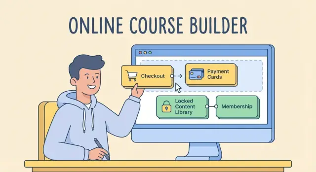
A smooth checkout is where interest turns into revenue. Keep it simple, familiar, and clear—students should understand what they’re buying and how they’ll be charged in under a minute.
Start with credit/debit cards, then add wallets (Apple Pay/Google Pay) if your platform supports them—wallets often reduce friction on mobile.
If you sell to regions where cards aren’t the default, consider bank transfer options. Some creators offer bank transfers for higher-priced programs, but keep in mind they can delay access unless you automate verification.
Your checkout should include:
Also make sure the buyer knows what happens next: “You’ll receive an email with access within X minutes.” If your platform supports it, show a simple confirmation page with a login link.
For VAT/sales tax, you have two common paths: use a checkout tool that calculates and collects tax automatically, or handle it accountant-led and keep your pricing structured accordingly. If you’re unsure, choose a tool that can record tax details per transaction and export reports—future you will be grateful.
Failed payments are normal, especially for subscriptions and payment plans. Enable:
When this is set up, your payment system quietly recovers revenue without extra support tickets.
Access control is the “gate” to your course: it decides who can view content, when they can view it, and what happens when something changes (like a refund). If you set this up clearly from the start, you’ll avoid most support headaches later.
Most no-code course setups rely on one of these rules:
Write the rule in plain language and place it on the checkout page and welcome email so expectations match reality.
Even if you’re starting with one course, build access rules that can handle more offers later:
The goal is simple: one payment event should map cleanly to one or more access permissions.
A few scenarios cause most “I can’t access my course” tickets:
Create a short internal checklist for:
Keep it in one place your team can follow—then link students to a simple help page like /help/access so they can self-serve before contacting you.
Where you host your lessons affects student experience, support load, and how well your content stays protected. The goal is simple: make lessons easy to find and hard to share unintentionally.
Most no-code course platforms let you upload files directly and serve them inside a logged-in player. This is the easiest option because access control and lesson navigation are handled in one place.
External video hosting (like a dedicated video provider) can be a better fit if you need faster streaming worldwide, automatic quality adjustments, or detailed video analytics. If you go this route, embed videos inside your course platform rather than sharing standalone links.
You don’t need spy-level security, but you do need a few basics:
Also: assume students will watch on phones. If accessing content is painful, they’ll ask for direct links—exactly what you’re trying to avoid.
Structure content like a clear path:
If your platform supports search, enable it. If it supports downloads, label them clearly (“Checklist PDF”, “Swipe File”, “Worksheet”).
Add captions to videos, export PDFs with selectable text (not scanned images), and check your lesson pages on mobile. Clean formatting and readable files improve completion rates—and reduce refund requests.
A great course isn’t just “content uploaded.” A little structure helps students stay motivated, reduces refund requests, and cuts down on support emails like “Where do I start?” You can do this without complex tech.
Dripping means releasing modules over time (for example: Module 1 today, Module 2 in 7 days). This works well when your course is action-based and you want students to practice between lessons.
Keep it simple:
If lessons build on each other (e.g., “Set up your basics” before “Run ads”), add prerequisites so students don’t skip steps and get stuck.
A lightweight approach:
Engagement doesn’t need fancy gamification. Add just enough interaction to keep students moving:
If you offer assignments, set expectations: where to submit, when (or if) you review, and what “good” looks like.
Students love knowing they’re “done.” Pick 1–2 completion signals you can support consistently:
When completion is visible, students are more likely to finish—and recommend your course.
Automation isn’t about sounding “corporate.” It’s about answering the same questions once, then letting your system deliver the answers at the right time—without you watching your inbox.
Set up a small set of essential messages that trigger automatically:
Keep these short and specific. A welcome email that answers “Where do I click?” and “What should I do first?” can eliminate a surprising amount of support.
New students should never have to guess what to do. Create an onboarding path that takes about ten minutes:
Watch/Read “How this course works”
Complete one tiny quick win (a checklist, a worksheet, a short lesson)
Bookmark the next step (Lesson 1 or Module 1)
If your platform supports it, pin this as the first lesson or a “Start Here” module.
Choose support options you can reliably maintain (and say them clearly in the welcome email):
Create templates for common requests: login help, access issues, invoice requests, refunds, and “where do I start?” Even basic snippets cut response time and keep your tone consistent.
If you end up needing custom workflows (for example, a self-serve “change my email” flow, corporate seat management, or a unified admin view across multiple products), building a small internal tool on Koder.ai can be a practical middle ground. Its planning mode, snapshots, and rollback help you iterate safely—without breaking your live checkout or enrollment process.
If you’re selling a course without code, you have an advantage: most no-code platforms already track key events. The goal isn’t to stare at dashboards—it’s to spot where people hesitate, fix that step, and measure again.
Start with a simple funnel view:
Landing page visits → checkout → purchase → start the course
A “sales problem” often turns out to be a “start problem.” You might be getting purchases, but students don’t log in or begin lesson one—then refunds and support requests follow.
Practical tip: define one primary metric for each step (visits, checkout starts, purchases, lesson 1 starts). If your platform doesn’t show all of these, you can still approximate with basic analytics plus your course tool’s enrollments.
Common drop-offs to monitor:
What to do when you see them:
Numbers tell you where; feedback tells you why. Keep it lightweight:
Over time, you’ll notice patterns—especially around unclear promises, confusing navigation, or mismatched expectations.
Resist the urge to remake the course first. The fastest wins usually come from:
Change one thing at a time, keep notes on the date, and compare the same time window before/after. Once the funnel is healthy, then consider bigger work like re-recording lessons or expanding modules.
Before you announce anything, do one calm, methodical pass through the entire student journey—from “I’m interested” to “I finished lesson one.” A small checklist now prevents messy refunds, access complaints, and missed sales later.
Confirm the basics are consistent everywhere:
Create a $1 test product or generate a 100% off coupon for your real course. Then:
Draft your announcement emails and social posts, and keep a simple FAQ ready (login issues, refunds, access length, “where do I start?”). Plan who answers support, what your response time is, and where people should write you.
Decide what happens after the first wave: an upsell (1:1 call, advanced module), a bundle, an affiliate program, or a cohort-based relaunch. Even a lightweight plan turns a one-time spike into steady sales.
Start with four building blocks:
If a purchase doesn’t trigger access automatically, fix that before adding extras like community or certificates.
Use the simplest format that matches how you’ll deliver value:
Your choice affects drip settings, support load, and how you structure checkout and onboarding.
Write a quick “delivery inventory” before you build anything:
This prevents missing assets later and helps you pick a platform that actually supports what you’re selling.
Pick one clear rule and state it on the landing page and checkout:
Clear access terms reduce refunds and “I thought I had access forever” disputes.
Choose all-in-one if you want speed and fewer integrations (pages + checkout + hosting in one place). Choose best-of-breed if you need specific tools (advanced checkout, CRM, analytics) and can manage integrations.
Practical test: write down what each tool does. If two tools overlap (e.g., both send emails or host videos), you’ll either pay twice or create confusion.
Check limits that impact growth and support:
Also confirm features you’ll rely on for cohorts (comments, groups, live session support).
Keep it focused and scannable:
Add proof that feels real: a relevant instructor bio, specific testimonials (or a preview if you’re new), and a single primary CTA that always goes to one next step (checkout or waitlist).
Pick a model that matches delivery and buyer preference:
Then define inclusions in plain language: updates, support level, bonuses, and a specific refund/guarantee policy near pricing and checkout.
Make checkout boring (in a good way):
To reduce failed payments, enable smart retries, “update card” links, and short dunning emails—especially for subscriptions and plans.
Run one full end-to-end test before announcing:
Keep a simple support plan ready (common issues: login, duplicate emails, refunds, invoices) and point students to a help page like .
/help/access