Dec 14, 2025·8 min
How Snap Uses Camera-First UX, AR, and Youth Culture to Stand Out
Explore how Snap uses camera-first design, AR lenses, and youth culture insights to build a distinct consumer platform and durable product differentiation.
Explore how Snap uses camera-first design, AR lenses, and youth culture insights to build a distinct consumer platform and durable product differentiation.
Snap stands out because it treats the camera as the starting point of the experience, not an add-on.
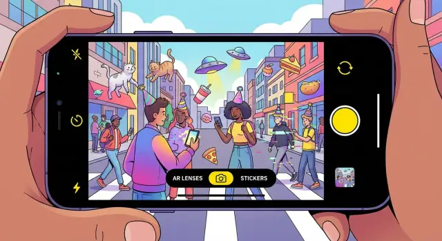
“Camera-first UX” means the app opens straight into the camera. The first thing you’re invited to do is make something—take a photo, record a video, add text, draw, or drop in an AR lens—before you scroll through other people’s posts.
That sounds like a small UI decision, but it changes the rhythm of the entire product.
Feed-first apps train users to arrive with a passive mindset: “What’s new? What did I miss?” Snap’s camera-first flow nudges a different intent: “What can I send right now?”
Because the default action is to create, communication feels more like a quick gesture than a carefully curated publication. The result is a platform that optimizes for sending rather than broadcasting.
Opening on the camera invites spontaneity. You don’t need a topic, a caption, or a perfect moment—you can respond immediately with a short video, a reaction face, or something deliberately silly.
AR lenses amplify that sense of play. They turn the camera into a toy and a stage at the same time, making ordinary moments feel interactive. That “I’m here, right now” presence is a big part of why Snap feels different from polished, feed-based social.
A differentiated consumer platform wins because it has a distinct default behavior and emotional payoff—not just a new feature.
For Snap, differentiation comes from the combination of camera-first creation, playful visual tools, and a social experience centered on close connections. Together, those elements shape how people communicate day to day.
Open many social apps and you’re greeted by a feed: a stream to scroll, react to, and occasionally post into. Snap flips that default. The first thing you see is the camera, which quietly tells you what the app is for: capture something, add a little context, and send it.
Feed-first onboarding trains “consumption first.” You browse, then decide whether to contribute.
Camera-first onboarding trains “expression first.” Even if you don’t send anything, you’re starting from creation. That shifts the mental model from publishing to messaging, which is why Snap often feels more like communication than performance.
A camera-first home screen reduces the steps between an idea and a message. You can open the app, take a photo or video, and share—without detouring through a profile page, composer screen, or a complicated post flow.
That speed matters because many moments worth sharing are small: a funny sign, a quick reaction, an inside joke. When creation is frictionless, users share more frequently and more casually.
Text-first sharing asks you to write something “good enough” for others to read. Visual messaging lightens that pressure. A photo with a quick caption, doodle, sticker, or short video often communicates the point without drafting a mini-essay.
For younger users in particular, this makes interaction feel more natural and less like a public statement. The camera becomes a conversational tool—closer to “talking” than “posting.”
The same design that optimizes quick visual communication can make other behaviors less prominent. Link sharing and long-form commentary become less central, and text-based discovery (finding ideas by reading) is weaker than on feed-led platforms.
In short: Snap’s camera-first UX deliberately prioritizes fast, expressive, private-leaning communication—at the cost of being the best place for links, lengthy text, or browsing-by-reading.
AR lenses aren’t just a feature inside Snap—they’re a habit-forming loop. When you open the camera and see a rotating shelf of effects, the app offers an immediate promise: “try something fun right now.” That promise is repeatable because the content changes constantly and the payoff arrives in seconds.
Under the hood, lenses combine a few core building blocks:
The key is that none of this asks users to learn “AR.” It’s presented as a simple, tappable menu that works instantly.
Lenses work like a pocket-sized toy: quick experimentation, surprising outcomes, and social shareability. You don’t need a plan or a polished aesthetic. You can cycle through options, laugh at the result, and move on—then do it again tomorrow because there’s always something new to test.
AR is a safe way to explore identity—different looks, moods, personas—without making a lasting statement. A lens can be silly, weird, cute, or expressive, and because it’s tied to a moment rather than a permanent feed, it encourages play rather than perfection.
The delight only works because the path is short: open → try → record → send. No setup, no editing timeline, no pressure to caption perfectly. Snap’s AR succeeds by compressing the distance between curiosity and sharing into a few seconds.
Snap’s defining social move wasn’t a new format—it was a new default. When a message is designed to disappear, it changes what people feel comfortable sending. That “ephemeral by default” expectation lowers the perceived cost of being imperfect, which reduces posting anxiety and makes casual, everyday communication feel safe.
Permanent posts invite self-editing: the caption has to be right, the photo has to be flattering, and the moment has to be “worthy.” Ephemeral sharing shifts the frame from publishing to chatting. A blurry dog video, a weird-angle selfie, or a quick reaction becomes acceptable because it isn’t meant to be part of a lasting personal brand.
That’s the heart of low-stakes communication: content can be spontaneous, context-heavy, and slightly messy—more like real life.
Snap’s emphasis on friends-first, private exchanges differs from broadcast-first platforms where the default audience is large and unknown. In a private thread, you’re communicating with “close ties” who share context and history, so you can skip the performance layer.
This dynamic supports lightweight daily habits—think streak-like routines or quick check-ins—without needing big creative effort each time. The app becomes a place to maintain relationships through frequent small touches, not occasional polished posts.
Importantly, disappearing content can coexist with choiceful permanence. Snap’s memories/archives idea gives users control: everyday messages can vanish, while meaningful moments can be saved intentionally. That combination preserves the comfort of impermanence while still allowing a personal history when users want it.
Younger audiences tend to adopt new communication formats first because their social lives are higher-frequency and more peer-driven: lots of check-ins, quick coordination, and constant micro-updates. When the cost of sending a message is low—and the reward is immediate feedback—new “languages” spread fast.
On Snap, the norms are easy to spot: short bursts instead of long posts, quick replies instead of threaded debates, and shared humor that works without context. Visual slang—faces, gestures, filters, scribbles—often communicates tone faster than text. Inside jokes thrive because the content is meant for a small circle, not for public interpretation.
The key is to treat these behaviors as patterns, not permanent traits. People move between modes depending on the moment: sometimes they want performance (public), sometimes comfort (private), and sometimes speed (ephemeral). Snap leans into the comfort-and-speed modes.
Snap’s design doesn’t just “target Gen Z”; it operationalizes community norms into repeatable actions:
That feedback loop matters: when an app makes the “native” way a group communicates feel effortless, it stops being a marketing story and becomes a daily habit.
Snap’s social graph is built around people you actually know. That sounds simple, but it changes the physics of growth: instead of chasing “followers,” users return because their closest friends are there—and because the app makes those relationships feel active.
Snap encourages small, high-frequency interactions: quick replies, short bursts of video, and casual check-ins. Features like Best Friends (and the social signals around streaks and quick-response behavior) create lightweight incentives to keep a handful of relationships warm.
This produces a different kind of network effect than public platforms. It’s less about one creator drawing millions, and more about many private micro-networks reinforcing daily habit.
When communication is mostly 1:1 or small group:
These loops are hard for competitors to copy because they depend on real social ties and established norms between friends (how you joke, what you share, what’s considered “too much”).
Leaving Snap isn’t like uninstalling a utility app. Users would have to rebuild:
Even if another platform offers similar features, the cost is social: convincing your circle to move together.
Friends-first graphs don’t naturally produce public reach, which limits easy “broadcast” monetization. Ads and branded content have fewer obvious surfaces than a feed built for mass consumption—so Snap has to work harder to create premium inventory without breaking the intimate vibe. That tension shows up across product choices and ad formats (see /blog/ar-advertising).
Snap’s content layout is designed to start with people you know, then gently expand outward into entertainment. That ordering matters: it keeps the app feeling personal first, and “media” second.
Stories are the familiar, lightweight update format—quick moments that live for a limited time. In practice, Stories are where you keep up with friends and a few accounts you’ve chosen to follow.
Spotlight is Snap’s short-form, viral video feed. It’s built for browsing when you don’t have a specific person in mind—more like “show me something fun,” less like “message my friend.”
Discover is the more produced side: publishers, shows, and creator series. It’s where you go for something that looks closer to entertainment programming than a personal update.
The app’s default “home base” is friends and direct communication, with entertainment placed as a secondary destination. That separation reduces the feeling that you’re performing for a public audience every time you open the app. You can catch up with close friends, then switch modes when you want to be entertained.
Snap mixes two approaches:
The result is a simple mental model: relationships are explicit; entertainment is optimized.
You can visualize the flow like this:
Friends → Stories → Spotlight/Discover
Start with people you know, then “zoom out” to wider content when you’re in a browsing mood.
Snap stays interesting because there’s always something new to watch, remix, or respond to—and that supply isn’t coming from one “creator class.” On Snap, creators range from big influencers and professional media partners to everyday users who casually post Stories, Spotlight clips, or quick friend updates.
Influencers and semi-pro creators bring repeatable formats: skits, beauty routines, sports takes, or daily vlogs.
Publishers and media partners provide consistent, higher-production content that can feel closer to “lean-back” viewing.
Everyday users matter just as much: their Snaps, Stories, and inside jokes create the social gravity that keeps the app personal.
Snap’s creation stack reduces the friction between “idea” and “post.” AR lenses let people instantly add a visual hook; templates and editing shortcuts help content look polished without feeling over-produced; music and sound tools make short clips more emotionally legible; and lightweight editing (trim, captions, stickers) supports fast iteration.
If you want a deeper walkthrough of what’s available, see /blog/creator-tools-guide.
The incentives are mostly about feedback loops rather than flashy status:
The net effect is steady freshness: professional content raises the floor, while everyday creativity keeps the tone authentic and socially relevant.
Snap’s most distinctive ad unit isn’t a banner or a pre-roll—it’s an experience. With augmented reality (AR) lenses, ads can behave more like a mini product demo you use than a message you scroll past.
AR advertising on Snap often takes the form of sponsored lenses and filters that let people “try” something instantly:
The key is that the camera is already the primary interface. So the ad doesn’t feel like a detour; it’s a natural extension of what people came to do.
Most feed ads work by interruption: you’re consuming content, then an ad blocks the next piece of content.
AR ads work through participation: users opt in by tapping, trying, playing, and sharing. That changes the psychology. Instead of “I was forced to watch,” it becomes “I discovered something fun (and it happened to be branded).” Participation can also create more memorable product understanding—because the user is actively exploring rather than passively receiving.
The more immersive an ad is, the more it depends on trust. A few things matter most:
When those basics are handled well, AR ads can feel like value-added content rather than clutter.
If you’re evaluating AR as a channel, you might pair creative testing with clear measurement goals and packaging options—see /pricing for an example of how teams often compare formats and spend levels.
Snap doesn’t try to “win social” in every dimension. It competes on a specific bundle of strengths—and accepts trade-offs elsewhere.
Camera-first UX: The app opens to creation, not consumption. That single default pushes users toward making quick, visual messages instead of drafting posts.
AR depth (not just filters): Lenses are a repeatable habit, with fresh, playful drops that make the camera feel like a toy you can’t quite exhaust.
Friends-first graph: Snap’s core interactions lean into real relationships. Compared with interest-led feeds, this can feel more private, more personal, and less performative.
Culture fit with younger users: Features, tone, and pacing often match how younger audiences actually communicate—fast, visual, and informal.
Long-form video and discovery: YouTube (and increasingly TikTok) can be stronger for intentional viewing sessions, search, and “I want to learn/watch X.”
Public text discourse: Platforms like X or Reddit excel when the primary unit is opinion, debate, and link sharing.
Commerce and monetization infrastructure: Meta’s ecosystem is typically ahead on mature ad tooling, shopping integrations, and cross-app business workflows.
Snap’s defensibility isn’t one feature. It’s the way camera-first UX + AR novelty + friend graph + cultural resonance reinforce each other.
If you’re building consumer products, this is also where rapid prototyping matters. Teams sometimes use vibe-coding tools like Koder.ai to spin up testable React front-ends and Go/PostgreSQL backends from a chat prompt—useful when you want to validate a “default screen” (camera-first vs. feed-first), a creation flow, or an interaction loop before committing to a full engineering cycle.
Snap’s growth challenge is unusual: the “product feel” is the point. If scaling adds friction, makes the app louder, or turns private moments into public performance, users notice immediately.
The safest path to scale is to preserve the camera-first, friends-first loop and expand around it. That can mean:
The goal is additive growth: new surfaces for new audiences without turning the main experience into a feed that competes with itself.
At Snap’s scale, safety and wellbeing aren’t separate initiatives—they constrain design. Defaults (who can contact you, how content is shown, what gets recommended) shape user comfort. Privacy expectations are especially high for messaging and close-friends sharing, so product changes should minimize surprises: clearer controls, predictable visibility, and interfaces that help people understand where content goes before they post.
Snap has to moderate different formats at once: private messaging, public creator content, and user-generated stories. Each has different risks and signals. Messaging can be harder because context is private; public surfaces can amplify issues faster.
Scaling requires investing in systems that combine automated detection with human review, plus product design that reduces abuse opportunities (for example, thoughtful friction and reporting flows).
Avoid unverifiable claims about user intent, harm reduction, or algorithm performance. When writing about outcomes, ground statements in public sources (e.g., Snap Inc. investor materials, earnings letters, and transparency reporting) rather than speculation.
Snap’s differentiation can be summarized in three reinforcing pillars: a camera-first UX that makes creation the default, AR lenses that turn creativity into a repeatable habit, and youth-driven norms that keep the product aligned with how people actually communicate (fast, visual, and socially contextual).
Start with a “default action” that expresses your product’s core value in one tap. For Snap, that’s opening to the camera—no choice paralysis, no feed-first detour.
Design for playful creation, not just consumption. AR works because it lowers the effort to make something worth sharing, while still feeling personal.
Treat culture as product input. If your audience’s norms change weekly, your UX, content formats, and moderation expectations can’t be updated quarterly.
Build social loops that feel like friendship, not broadcasting. Friends-first dynamics encourage frequent, low-pressure sharing—then you can layer discovery and entertainment on top without losing intimacy.
To see whether these principles are working in your own app, track:
If you want practical frameworks for designing defaults and interaction loops, continue at /blog/product-design. For a clearer view of how playful formats translate into measurable campaigns, see /blog/ar-marketing-basics.
Snap opens directly to the camera, so the first thing you’re prompted to do is create (photo/video/lens/text) rather than scroll a feed. That default makes sharing feel like quick communication instead of public publishing.
Starting with creation changes the user’s intent from “what’s new?” to “what can I send right now?” That shift reduces the pressure to be polished and increases casual, frequent sharing—especially in 1:1 or small-group contexts.
A camera-first home screen cuts steps between idea and send:
Fewer taps matters because many shareable moments are small and time-sensitive (reactions, inside jokes, quick updates).
They’re presented as a simple, tappable menu, but commonly rely on capabilities like:
The product win is that it feels instant—users don’t have to “learn AR” to enjoy it.
Because they function like a “repeatable delight” loop:
It becomes a quick habit: open → try → record → send.
When content is designed to disappear, it lowers the perceived cost of imperfection. Users feel freer to send:
That shifts communication from “posting for a profile” to “chatting with people who get it.”
A friends-first graph is built around people you actually know, which changes the reward:
It’s also harder to copy, because it depends on real-world relationships and shared norms.
Snap typically starts with friends, then expands outward:
A useful mental model is Friends → Stories → Spotlight/Discover.
AR ads behave more like interactive experiences than interruptions. Common uses include:
For trust, campaigns need clear sponsorship disclosure, strong relevance, and frequency control so the camera doesn’t feel “taken over.”
Track metrics that reflect creation and sharing, not just passive viewing:
If you need related frameworks, see /blog/product-design.