Nov 03, 2025·8 min
Subscription skip pause and address changes: rules and UI
Subscription skip pause and address changes can cut churn and support load when rules are clear, UI is predictable, and edge cases are handled upfront.
Why these subscription controls make or break retention
A consumables subscription only works when people feel safe staying subscribed. That’s true whether you ship protein powder, vitamins, coffee, razor refills, or skincare. People expect their needs to change month to month, and they judge you by how easy it is to adjust.
Skip, pause, and address edits create churn when they feel risky. If a customer isn’t sure a change will “stick” before the next charge, many will cancel instead of experimenting. If they worry an order will ship to the wrong place or arrive while they’re away, they cancel to avoid the stress.
“Support chaos” is what happens when the rules are unclear and the UI hides consequences. It shows up fast, usually around billing and fulfillment.
Common symptoms look like this:
- Customers emailing “please stop my next box” after the charge already happened
- Duplicate shipments because a customer skipped but the system still generated an order
- Address change requests sent to support instead of handled self-serve
- Refund demands, chargebacks, and angry reviews after surprise deliveries
- Agents spending time explaining policy instead of solving real edge cases
The goal is simple: make changes self-serve and predictable. Predictable means a customer can answer three questions without guessing: what will happen, when it will happen, and what it will cost.
That’s why “subscription skip pause and address changes” shouldn’t be treated as extra settings. They’re retention controls. When they’re clear, customers pause for a busy month instead of canceling forever. When they’re confusing, every life event (travel, moving, trying a new flavor, budget tightening) becomes a cancellation moment.
Good controls also protect your team. Fewer tickets means fewer manual overrides, fewer one-off refunds, and fewer inconsistent answers. The product explains the rules at the moment the customer makes the change.
The rules you must define before building the UI
A subscription screen can only be as clear as the rules behind it. If you skip the rule work, customers will guess, get surprised, and contact support.
Write your subscription terms in plain language a customer can repeat back. Avoid internal terms like “billing cadence” or “fulfillment batch.” People need a simple mental model of time and what happens next.
Minimum definitions to lock down:
- Cycle: how often the order repeats (every 4 weeks, monthly on the 15th, etc.)
- Cutoff: the last moment a change will affect the next order
- Next ship date: when the next box is expected to leave (not just when it bills)
- Next charge date (if different): when payment is captured
- Eligible changes: what can be edited (items, quantity, address, date)
Next, separate actions that sound similar but behave differently. Customers expect “skip,” “pause,” and “cancel” to be distinct, so your product should treat them that way.
- Skip = skip the next order only, then resume automatically
- Pause = stop future orders until a date or until the customer resumes
- Cancel = end the subscription (define whether it stops only future orders or also blocks an already scheduled one)
Now define what an address change affects, and stick to it. This is where most confusion starts. Decide whether an address change applies to:
- Next order only (useful for travel)
- All future orders (useful for moving)
Be explicit about promos and extras when a customer changes anything. If someone skips during a “buy 3 months, get a free gift” offer, does the gift move or does the offer end? If a bundle discount depends on two items, what happens if they remove one? If inventory is low, can they delay without losing the price?
A simple test: take a shampoo subscription with a 2-day cutoff. If someone pauses the day before cutoff, do you still ship? If not, do they keep their discount when they resume? Answer questions like these before you design the UI.
Cutoff windows and fulfillment timing that prevent surprises
Most subscription problems start when customers and your ops team use different clocks. The fix is simple: publish one clear cutoff tied to the next shipment, and show it everywhere a change can be made.
Pick a cutoff that matches how your warehouse works. “Changes close 48 hours before shipment” is common, but the right window depends on pick-pack time, carrier pickup, and how often you batch labels.
After the cutoff, choose one behavior and stick to it:
- Block changes for the current order (clean and predictable), or
- Allow changes with a warning that clearly states what will happen (for example: “This update applies to the following order, not the one already processing.”)
The subscription skip pause and address changes screen should show three things near the top: next ship date, cutoff date/time (with time zone), and which actions are still available.
Decisions that remove most surprises:
- The exact cutoff timestamp (date + time zone), not just “2 days before”
- What happens after cutoff for each action (skip, pause, address edit)
- When payment is authorized vs captured
- What happens if inventory is short when a change is made
Payment timing matters more than teams expect. If a customer skips or pauses before cutoff, avoid capturing payment for that cycle and confirm “no charge this period.” If you preauthorize earlier, say so and explain when the hold drops.
Late address changes need a safety rule. If someone updates their address 12 hours before shipment and the label is already created, decide what you’ll do (block the current change, offer a paid reship, refund returned items) and show that outcome before they hit “Save.”
UI patterns that keep subscription changes simple
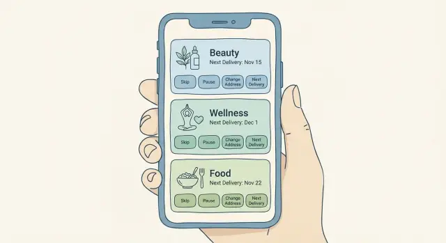
Anchor everything to one place: a single Next delivery card. It should show the delivery date, what’s in the box, the total price, and a compact address preview. When people can see what will happen next, they make fewer accidental changes and contact support less.
Keep the main controls focused on the three reasons people most often open the page:
- Skip next
- Pause
- Change address
Other options (change frequency, swap items, edit payment) can live behind a secondary “Manage” entry. Don’t bury the core actions.
A simple pattern that works well is: preview -> choose action -> confirm -> see the result. The confirmation step is where churn is prevented. Show the new next delivery date in large text, and repeat key details like price and address so the customer can catch mistakes.
A few UI details that do a lot of work:
- One primary “Next delivery” card with date, items, price, and address preview
- Three primary buttons with plain labels (no jargon)
- A confirmation view that states “Your next delivery is now…” with the updated date
- An activity log showing what changed, when, and by whom (you, household member, support)
- Short microcopy that puts timing and consequences near the action
Microcopy matters most around time. If changes have a cutoff, say it near the action, not buried in policy text. Example: “Changes to this delivery close tomorrow at 5:00 PM.”
Step-by-step flow for skip and pause (from tap to confirmation)
Prototype the Next delivery flow
Prototype a Next delivery card with cutoffs, totals, and confirmations in one place.
A good skip or pause flow answers one question immediately: what happens to my next delivery?
Start with a simple status card. Show whether the subscription is Active or Paused, the next charge date, the next ship/delivery date, and what’s in the next box. If there’s a cutoff (“Changes allowed until Tuesday 6pm”), show it in the same place.
When the user taps Skip or Pause, don’t make them guess the outcome. Preview the updated schedule before they confirm. Skipping should usually move the next delivery to the following cycle and keep the same cadence. Pausing should ask one clear question: pause until a specific date, or pause until I resume?
A flow that holds up in real life:
- Show current status plus “Next delivery” details, including the last day changes are allowed.
- After Skip or Pause is chosen, show the updated schedule (even “next two deliveries” is enough).
- Confirm on a summary screen: what changed, new dates, and whether payment is affected.
- Send immediate confirmation in-app, and email too if you normally email receipts.
- Offer a short undo window if fulfillment hasn’t started, and show exactly when it expires.
Keep the summary specific. For example: “You skipped April 12. Your next delivery is May 10. No charge will occur on April 11.” This prevents the classic ticket: “I paused but still got charged.”
Make undo safe. If the order is already packed or a label is printed, replace “Undo” with: “This order is already processing and can’t be changed,” plus the next available action (“Pause after the next delivery”).
Address changes: rules, edge cases, and a safe edit flow
Address edits are where a subscription can feel helpful or hostile. If people fear a mistake, they’ll cancel instead of changing details. The UI has to make one thing obvious: which address will be used for the next delivery, and what happens after that.
The rules to set upfront
Every address edit should start with a clear choice: change it for the next order only, or change it for all future orders. Many customers travel, move temporarily, or send one box as a gift. Forcing a permanent change creates errors and tickets.
Cutoffs matter. If the next order is already processing, say so before the customer saves. Use plain language: “This order is already being prepared. Your change will apply starting next month,” and show the exact date it will affect.
Validate early, not at the end. Catch missing fields as the customer types, and accept common unit formats (Apt, Unit, #, Floor). Address errors often look small but lead to failed deliveries.
A safe edit flow (that prevents surprises)
Keep the screen predictable:
- Show Next delivery address at the top with a clear preview.
- Let users pick Next order only or All future orders, with one short line explaining each.
- If it’s past cutoff, show a clear warning and the first delivery the change will affect.
- If you support saved addresses, let customers select one without retyping.
- End with a final summary: “Next delivery will ship to X on DATE.”
Multi-address cases need explicit labels. If you support gifting or split shipments, show each shipment line with its own address. If you don’t, say “One address per order” and guide the customer to a separate one-time order.
Example: someone on a skincare subscription is traveling for two weeks. They choose “next order only,” enter their hotel address, see a warning that this month is still processing, and the confirmation shows home for this delivery and hotel starting next month. That clarity is what turns address changes into self-serve instead of support chaos.
Pricing, promos, and inventory cases that trip teams up
Most subscription complaints aren’t about the skip or pause button. They’re about money and availability.
Decide what happens to discounts when someone skips or pauses, then make it visible at decision time. A simple, user-friendly rule is: discounts earned stay earned, but time-limited promos expire on their original end date. If you freeze a promo during a pause, say that before the customer confirms. If you remove it, show the new price and the reason.
Prepaid plans and limited-inventory boxes need extra care. Prepaid usually means you owe a fixed number of shipments, not a fixed calendar schedule. Pausing should pause the schedule without reducing remaining shipments. For limited stock, skipping can mean losing that month’s box. Say that before the customer taps confirm.
Add-ons and one-time items are another frequent trap. Make a clear promise about what “next order” means in your system, especially when the next order is skipped or the subscription is paused.
Out-of-stock handling should feel like user choice, not a surprise. Offer a small set of options: substitute, skip this shipment, or remove the out-of-stock item. If substitutions change price, require a clear confirmation.
Region rules can break trust fast. If shipping countries or product rules differ, block invalid swaps and explain why in plain language (“Not available in your region”). If a customer changes address to a restricted area, tell them what happens to the next shipment: product change, delay, or cancellation.
Example: a customer pauses, then resumes and expects their “first month 20% off” to return. If your UI shows “Promo expired on Oct 31” before they confirm resume, you prevent a chargeback and an angry email.
Common mistakes that create churn and support tickets
Test with customers sooner
Deploy a test app for real users and iterate on the points where they hesitate.
Most churn in consumables subscriptions isn’t about price. It’s about surprises. People feel trapped when the UI looks flexible but the system behaves differently once the next box is already in motion.
A common trap is hiding the cutoff until the last step. If someone taps Skip, gets close to confirming, and only then sees “Too late for this order,” they won’t trust the subscription again. Put the next charge date and edit deadline on the main subscription card.
Another repeat offender is accepting an address change without stating whether it applies to the next order. If the system is already picking and packing, say so and show what will happen instead (“This change starts with the Feb 12 order”). The same goes for delivery notes, gate codes, and apartment numbers.
Ambiguous words also cause confusion. Labels like “hold” or “snooze” mean different things to different people. Use dates and outcomes: “Pause until Mar 10” or “Skip next order (Jan 15).” Customers should never have to guess whether they’ll be charged.
Mistakes that most often turn subscription controls into support chaos:
- Cutoff rules are buried or shown only after the customer tries to confirm.
- Address edits are accepted, but the UI doesn’t say which shipment will use the new address.
- Actions use vague names with no dates, no next charge info, and no preview.
- No audit trail exists, so support can’t answer “Who changed this and when?”
- Skip/pause updates the screen, but background jobs still charge or queue fulfillment.
That last one is the most damaging because it feels like a broken promise. If billing and fulfillment run on scheduled jobs, treat skip/pause/address as first-class state that those jobs must read every time, not a UI-only flag.
Quick checklist for your subscription settings experience
A good subscription screen answers two questions before the customer changes anything: what happens next, and when.
Before you ship, try to manage a subscription in under 30 seconds. You should be able to confirm the next shipment details, make a change, and feel confident nothing unexpected will happen.
Checklist:
- Next order clarity: next delivery date (and estimated arrival if you show it), what’s in the box, and total price appear together.
- Change timing: cutoff date and time (with time zone) appears before the final confirm, and it’s obvious when it’s too late.
- Confirmation you can trust: after skip or pause, show the updated next shipment date and whether the customer will be charged.
- Mistake recovery: when possible, offer an undo option (or a short grace window) with an expiration time.
- Address impact: address edits clearly state whether they affect the next shipment, future shipments, or require a choice.
One practical check: write the support ticket you’re trying to prevent, then see if the UI answers it. Example: “I skipped, but was I still charged?” If the screen doesn’t explain charge timing for that action, add one sentence near the confirmation.
Example scenario: skincare subscription with a last-minute trip
Make skip and pause reliable
Model subscription state changes so billing and fulfillment jobs never ignore a skip or pause.
Maya is on a monthly skincare subscription that ships on the 12th. Today is May 8, and she just learned she’ll be traveling May 11 to May 25. She opens Manage subscription to avoid a box arriving while she’s gone.
The screen shows three facts right away: Next delivery: May 12, Edit cutoff: May 9 at 11:59 pm, and Estimated total: $38.00 (free shipping). Under that, she sees two clear actions: Skip next delivery and Pause subscription. She chooses Skip next delivery.
A confirmation sheet appears:
- You will skip the May 12 order.
- Your next delivery will be June 12.
- Your price stays the same.
- You can undo this until May 9.
After she confirms, the main page updates to Next delivery: June 12 and adds a small banner: Skipped May 12. An Activity panel records: “May 8, 3:14 pm - Skipped May 12 delivery.” Maya gets an on-screen confirmation number, so she doesn’t need to email support.
Two days later (May 10), she remembers she wants June to ship to her new apartment. She opens Shipping address and sees a warning: Changes to the next delivery are locked. You can still set an address for future deliveries. The UI offers two choices: Keep current address for June 12 (selected) and Use new address starting July 12.
If Maya tries to force the address change for June 12, she gets a firm, helpful message: Too late to change the June 12 shipment. Cutoff was May 9. The screen suggests the safest options: Contact support to reroute (if possible) or Set the new address for July onward.
This is what subscription management should feel like: clear dates, visible totals, specific cutoffs, and an activity log that proves what happened.
Next steps: turn rules into a working subscription management screen
Start with rules, not screens. Write each rule as a short statement that a support agent can repeat word for word. If two people on your team explain the same situation differently, your UI will be confusing too.
A good rule set sounds like this: “Changes to the next order must be made before 6pm two days prior,” or “A pause stops future orders but doesn’t cancel the subscription.” Keep the list small and settle it before design.
Prototype the essentials first
Build one card that answers the question customers care about: “What happens next?” Your “Next delivery” card should show the date, address, items, price, and the cutoff time to change it.
Then prototype the three actions customers use most: Skip next, Pause for a period, and Change address. Each action should end with a confirmation that repeats the new next date and what happens if the customer does nothing.
Test, then add visibility before you scale
Run quick tests with 5 to 10 real customers (not teammates). Give them tasks like “skip the next order” and stay quiet. Watch where they hesitate: wording, cutoff explanation, fear of losing a discount. Fix those moments before you add more options.
Before you drive volume to the page, add two things that prevent support chaos:
-
Logging for every subscription change (who, what, when, previous value, new value, cutoff status).
-
A simple admin view that shows the next scheduled order, the last few changes, and whether each change applies to the next shipment or the one after.
If you want to turn these rules into a working prototype quickly, Koder.ai (koder.ai) can help you build and iterate on the flows from chat, then generate an app you can refine, including confirmations and rollback-friendly snapshots.