Jun 22, 2025·8 min
Turn a PDF or Google Doc Into a Website (Fast Workflow)
Learn the fastest workflow to turn a PDF or Google Doc into a live website—clean layout, links, SEO basics, accessibility, hosting, and easy updates.
Learn the fastest workflow to turn a PDF or Google Doc into a live website—clean layout, links, SEO basics, accessibility, hosting, and easy updates.
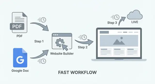
This workflow turns a PDF or Google Doc into a simple, readable website—quickly. Think of it as “document to web page” publishing: you start with content you already have, and end with a public link you can share.
It’s ideal when your goal is to publish a clear, single-message site without a big build:
If you’re searching for “pdf to website” or “google doc to website,” this is the practical path when speed matters more than custom features.
“Fast” doesn’t mean low quality—it means minimal setup:
In many cases you can go from document to a live, shareable URL in a few hours—especially if the content is already written and approved.
A document-based website is a good fit when:
You’ll likely want a full CMS (or a more traditional build) if you need a blog with frequent posts, complex navigation, ecommerce, memberships, or lots of interactive components.
By the end of this workflow, you’ll have:
Before you convert anything, decide what your “source of truth” will be: a PDF you already have, or a Google Doc you’ll keep editing over time. This one choice affects speed, how painful updates feel, and the export tools you can rely on.
Choose a PDF when the content is already approved (a brochure, report, menu, one-pager) and you mainly need it to be readable on the web. PDFs are fast to start with, but slower to update—changes usually require editing in the original design tool, re-exporting, and re-uploading.
Choose a Google Doc when you expect frequent edits (pricing, schedules, policies, living docs). Google Docs is easier for teams, keeps history automatically, and exports cleanly to formats many website builders can ingest.
A simple rule: if you might edit wording weekly, start from a Google Doc. If the layout is part of the message (designed PDF) and edits are rare, start from the PDF.
Ask two questions:
If you’re unsure, start as a single page. You can split it later once you see what visitors actually use.
Pick one home for the source file and stick to it (Google Drive folder, Dropbox, or a shared internal folder). Use a naming pattern that won’t break under pressure:
project-name__web-source__YYYY-MM-DD
Keep older versions, but don’t duplicate “final_FINAL_v7.pdf” across devices. If you’re working from a PDF, also store the editable original (Doc/Slides/Design file) next to it.
Do a quick pass on the document itself:
Once the source is chosen and cleaned, the conversion step becomes a predictable, repeatable workflow instead of a one-off scramble.
Before you convert anything, do a quick pass that makes the web version easier to scan, search, and maintain. This is the difference between “a document posted online” and “a page people actually read.”
Use clear, consistent heading levels so your converter (and later, your website) can turn them into real H1/H2/H3 structure.
Tip: If you’re in Google Docs, apply Heading 1 / Heading 2 / Heading 3 instead of just bolding text.
If your document is more than a few screens, add a small table of contents near the top. Keep it short: 5–10 items is enough. Readers use it to jump to what they need, and it makes your future web layout easier.
In Google Docs, you can insert a table of contents that automatically updates. In a PDF, you can add a manual list of section names that you’ll later convert into links.
Page numbers don’t mean much on the web (screens resize, layouts change). Replace:
If you already know the section will become a link, write it exactly as the section title so it’s easy to connect later.
Quick image hygiene:
This cleanup takes minutes and saves you from slow pages and confusing visuals after conversion.
The goal here isn’t to “preserve the document perfectly.” It’s to extract clean text and structure so the web page is easy to read, easy to style, and easy to update.
From Google Docs:
From PDFs:
Copy-paste pitfalls to watch for: random extra line breaks, double spaces, smart quotes turning weird, bullet lists breaking into plain lines, and headings turning into giant bold paragraphs.
Aim to recreate structure using web conventions:
Documents often rely on specific fonts and color blocks that don’t translate well to the web. Keep it simple:
If you can’t select text in the PDF, it’s likely scanned. You’ll need OCR (Optical Character Recognition) to turn images of text into editable text.
Do a quick quality check after OCR:
Once you have clean text and real headings/lists, you’re ready to put it into a readable page layout—without the “document weirdness” that makes web pages feel off.
A document can be perfectly written and still feel hard to read on a phone. Your goal is to turn “pages” into a scrollable web page that feels intentional: clear hierarchy, predictable navigation, and obvious next steps.
Use a basic page skeleton:
If your PDF/Doc begins with a long introduction, consider adding a short “summary” paragraph at the top, then move the longer context into its own section.
Take your document headings (H2/H3 equivalents) and make each one a section with an anchor ID. Then add a simple navigation that jumps to those sections.
Keep navigation short—think 5–8 items. If you have more, group smaller headings under a single section (for example, “FAQ”).
Tip: Use human-friendly labels in the nav (“Pricing”, “About”, “Contact”), even if the document headings are longer.
Decide what you want readers to do next. Pick one primary CTA and repeat it in a couple of logical places:
Examples: Contact, Book a call, Download, Request a quote. Keep buttons short and avoid stacking multiple buttons side-by-side.
Web reading is faster than document reading. Tighten your layout:
A good rule: if you wouldn’t want to read it while standing in line, it’s too dense.
A document-to-website workflow is fast, but SEO doesn’t happen automatically. The goal is simple: make the page clearly about one topic, easy to scan, and consistent with what people searched for.
Your page title (the H1 on the page) should say exactly what the page is, using plain language people actually search.
Good examples:
Then write a 2–4 sentence intro at the top that matches search intent and confirms the visitor is in the right place. Mention who it’s for, what’s inside, and any key details (city, date, product name, version).
Your meta description won’t “rank” the page by itself, but it strongly affects clicks. Keep it aligned with what’s on the page—no bait-and-switch.
A simple formula:
Example:
“Read Acme’s 2025 employee handbook: PTO, benefits, remote work rules, and code of conduct. Updated March 2025.”
Document conversions often produce vague headings (“Section 1”, “Overview”) or heading levels that don’t reflect structure. Fix this by:
For links, avoid “click here” or “download.” Use link text that explains what someone will get:
This helps both readers and search engines understand your page.
If your page includes images (logos, charts, screenshots), add alt text so screen readers can describe them and search engines can interpret them.
Alt text should describe the image’s purpose, not stuff keywords into it.
Examples:
If an image is purely decorative, it’s fine to leave alt text empty (so screen readers skip it).
A short FAQ can help match long-tail searches and reduce support questions. Add 3–6 questions you hear often, using the same words customers use.
Good FAQ prompts:
Keep answers short and consistent with the main content—no new promises you can’t support.
A document can look “fine” on your laptop and still be frustrating (or impossible) to use on a phone or with assistive tech. The good news: a few fast checks catch most issues before you publish.
If your PDF is actually a scanned image, users can’t search, select, zoom-read cleanly, or use screen readers properly.
Quick test: try to highlight a sentence and copy/paste it into a note. If you can’t, you’ll need to run OCR (optical character recognition) or go back to the Google Doc/source file and export again.
Aim for comfortable reading without pinching and zooming:
If your conversion tool lets you pick a theme, choose the simplest one with high-contrast defaults and clear typography.
Document-based pages often end up with lots of small, tightly packed links.
Headings are how screen readers and mobile users scan:
Even if your main goal is a web page, providing the original PDF helps people who want to download, print, or read offline.
Add a simple link near the top or bottom: “Download as PDF.” (Keep it a normal link, not hidden behind an icon.)
If you want a quick extra check before publishing, open the page on your phone and try to do three tasks: find a key section, click two links, and read a full paragraph without zooming. If any of those feel annoying, fix that first.
Publishing is mostly a choice between “quick now” and “easy later.” The best option depends on whether your output is a single HTML page, a few pages, or something you’ll keep updating.
Static site hosts (Netlify, Vercel, Cloudflare Pages) are fastest when you already have HTML/CSS (or an exported folder). You drag-and-drop a folder or connect a repo, and you get a live URL in minutes.
Website builders (Squarespace, Wix, Webflow) are fastest when you want layout tools, forms, and a styled template without touching files. They cost more, but reduce setup friction.
Doc-publishing tools (Notion publish, Google Docs–to–web tools, Readymag-style doc publishing) are fastest for frequent edits, because you update the doc and the site changes with it. The tradeoff is less control over SEO and page structure.
If you want to skip most of the glue work (conversion cleanup → layout → deployment), a vibe-coding platform like Koder.ai can help you turn your document content into a simple React-based site via chat, then deploy and host it with a custom domain. It’s especially useful when you still want real code output (with export) without rebuilding a full pipeline.
What you need: buy a domain, then point DNS to your host (usually a CNAME or A record). Most hosts provide a guided checklist and free HTTPS.
What can wait: custom email, advanced redirects, analytics, and performance tuning. Get the site live first.
Before you hit publish, scan for personal phone numbers, home addresses, signatures, hidden comments, and embedded metadata. If this came from a client doc or a contract-like PDF, assume something sensitive is inside.
At minimum, add a short contact section (email + response time). If you can, create /contact with a form (builder) or a mailto link (static).
Put your key links in the header or footer: /pricing, /blog, and /contact. On one-page sites, repeat them once near the end so readers don’t have to scroll back up.
A document-based site is only “fast” if it stays easy to maintain. The trick is to decide what your single source of truth is, then make publishing a repeatable routine.
Treat the Doc as the master file—your website is the output.
Make edits in the Doc, then re-export (or re-sync) using the same settings every time. Keep headings consistent (H1/H2/H3), and avoid manual styling that won’t translate well.
When you publish, keep the same page URL. That way you can update content without changing where it lives.
PDF updates are usually: edit the original file → export a new PDF → convert/publish again.
To make that less painful, keep the editable original (Google Doc, Word, InDesign, etc.) alongside the exported PDF in a clearly named folder. When you update:
Add a small “Last updated” line near the top, and a short changelog at the bottom (2–5 bullets is enough). Also keep backups:
policy-2025-12-23.pdf)policy.pdf)This makes it easier to roll back if something breaks. (Some platforms—including Koder.ai—also support snapshots and rollback, which can be a safety net when you’re iterating quickly.)
Broken links usually happen when filenames or page slugs change:
A stable URL + visible update date builds trust and saves you from “which version is this?” confusion.
Moving from a document to a real web page is mostly about removing “document assumptions.” Here are the issues that slow people down—and the quick fixes that keep the workflow fast.
Spacing and line breaks often get converted into weird gaps or walls of text. Instead of relying on manual line breaks, reapply structure with real headings and paragraphs after conversion.
Tables can collapse on mobile or turn into unreadable blocks. If a table is purely for layout, replace it with sections and bullet lists. If the table contains real data, keep it—but simplify: fewer columns, shorter labels, and consider stacking rows on small screens.
Special characters (smart quotes, en dashes, symbols) may turn into boxes or junk text. After conversion, do a quick search for “□”, “�”, and odd spacing around punctuation.
Hyphenation from PDFs can create broken words (“infor-\nmation”). Use find/replace for common patterns, or re-copy the affected paragraph from the source without hyphenation.
Documents often hide image problems until they hit the web:
A single long page can work well—if people can jump around.
Add a small table of contents near the top, then use jump links to sections (e.g., “Pricing,” “FAQ,” “Contact”). Also consider repeating a simple CTA (“Book a call,” “Download,” “Email us”) every few sections.
Don’t upload a PDF and call it a website. It’s hard to read on mobile, weak for SEO, and frustrating for accessibility. If you must provide the PDF, offer it as a download link and make the web page the primary experience.
Once your document is live as a web page, the fastest way to make it better is to watch what real visitors do—then adjust one small thing at a time.
Start with three numbers:
If you’re using an analytics tool (GA4, Plausible, etc.), set it up and verify it’s recording visits. If you don’t want a complex setup yet, you can still learn a lot by adding UTM tags to links you share in newsletters or social posts.
For link clicks, the simplest approach is to:
If you have multiple important links (pricing, booking, contact), consider tracking them as events later—after you’ve confirmed basic page view tracking works.
Give visitors an easy way to tell you what’s missing:
Place it near the bottom under a heading like “Questions?” so it’s easy to find.
Run quick experiments every week or two:
Keep a tiny changelog in the doc (date + what you changed) so you can connect edits to results.
Move to a multi-page site or CMS when you need:
At that point, keep this page as a focused landing page and link out to deeper pages (for example, /pricing or /contact).
Use this workflow when you need a clear, mostly static page fast: a one-pager, brochure, resource sheet, event info, or a simple “here’s the info + here’s what to do next” landing page.
It’s not a great fit if you need frequent posts, accounts, ecommerce, complex navigation, or interactive features—those usually justify a full CMS or a more traditional build.
Pick Google Docs if you expect ongoing edits (weekly wording changes, pricing updates, schedules, policies). It’s collaborative, versioned, and re-exporting is simple.
Pick a PDF if the content is already approved and layout is part of the message (brochure/report/menu) and updates are rare. Just remember: updates typically mean editing the original design file, re-exporting, then republishing.
Ask:
If you’re unsure, publish as a single page first and split it later based on what visitors actually use.
Do a quick pre-flight pass:
This makes conversion cleaner and the final page easier to scan.
From Google Docs, the fastest starting point is File → Download → Web Page (.html, zipped). You’ll get basic HTML plus an assets folder.
For short docs, copy/paste can work, but watch for messy inline styles, broken lists, and odd spacing. If paste looks “off,” it’s usually faster to rebuild structure (headings/lists) than to fight the formatting.
If it’s a text-based PDF, try exporting to HTML or Text with a PDF tool, then clean up headings, line breaks, and lists.
If you have access to the original editable file (Doc/Word/InDesign), prefer that—PDF conversion is often slower because you’ll spend time fixing hyphenation, broken lines, and misidentified headings.
You likely need OCR (Optical Character Recognition) if you can’t highlight/copy text.
After OCR, spot-check the risky parts:
Don’t publish OCR output without a quick scan—small errors can become credibility problems.
Focus on web structure over perfect “document look”:
This improves readability on phones and makes the page feel intentional.
Cover the essentials:
To keep updates painless:
The goal is clarity: one topic, scan-friendly structure, and readable text (not trapped in a PDF).
This prevents “which version is this?” confusion and keeps shared links working.