Jul 17, 2025·8 min
Usable encryption: Moxie Marlinspike on UX and security
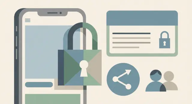
Usable encryption matters because people bypass security that slows them down. Learn practical UX patterns for auth, sharing, and key management that stick.
When secure systems fail: people work around them
A system can be “secure on paper” and still be unsafe in real life. Many designs assume perfect behavior: everyone reads warnings, follows every step, and never makes mistakes. Real people do the opposite when they’re busy, stressed, or trying to get work done.
That gap is where security quietly breaks. If an encrypted message takes five confusing steps to open, people don’t become more careful. They look for a shortcut that feels dependable, even if it weakens protection.
These workarounds often look harmless, but they undo the point of encryption. People send screenshots instead of using a secure viewer, paste secrets into notes or chat “just for a minute,” reuse the same password across tools, turn off a feature that “keeps getting in the way,” or share an account because access controls feel too slow.
Usable encryption isn’t about teaching users cryptography. It’s about making the safe path the easiest path, with fewer decisions and fewer ways to get stuck. When people can finish the task quickly and confidently, they don’t need shortcuts.
Moxie Marlinspike’s lesson: security that people can actually use
Moxie Marlinspike’s work keeps pointing to a simple truth: security only works when it fits real human behavior. People are busy, distracted, and often under pressure. If a secure flow adds friction, they’ll find a faster path, even if it quietly breaks the protection you meant to provide.
That’s why the old mindset of “users are the enemy” produces bad products. It treats normal behavior as sabotage. The result is design that leans on scolding and punishment: complex rules, scary popups, and “don’t do this” messages. Those choices train people to click through, share passwords, reuse codes, or turn features off. You don’t get safer outcomes, you just get quieter failures.
Encrypted messaging shows this without getting technical. When people had to compare long fingerprints, manage keys by hand, or interpret ambiguous security alerts, many skipped the checks. The tool was “secure” on paper, but the security didn’t survive everyday use.
Usable encryption isn’t weaker encryption. It’s encryption wrapped in flows people can complete correctly, every time.
In practice, “usable” often comes down to four traits:
- Understandable: the app explains what’s happening in plain words at the moment it matters.
- Fast: the secure choice is also the easiest choice.
- Forgiving: small mistakes don’t cause irreversible damage.
- Recoverable: if a phone is lost or a session expires, people can regain access safely without panic.
Picture someone switching to a new phone. If the only recovery path is “find the old device and export keys,” many will screenshot codes, store secrets in notes, or fall back to an insecure channel. A usable design expects that moment and makes the safe path obvious.
Why usability breaks encryption in the real world
Encryption usually fails at the moments where real people touch it. Not because they dislike privacy, but because the “security tax” shows up when they’re busy, stressed, or trying to help someone else.
The pain points are predictable: first-time setup that asks users to make choices they don’t understand, login flows that add steps without explaining why, switching devices and suddenly losing access, trying to share something quickly and hitting confusing permissions, and recovery after a lost device or forgotten password.
Once friction is high, people do what works. They reuse passwords, keep sessions logged in forever, turn off extra checks, or move the “secure” conversation to a faster app.
Cognitive overload is a big driver. Many secure products ask users questions like “Which key do you want to trust?” or “Do you want local or server-side encryption?” Most people don’t have a mental model for that, so they guess. If the UI adds scary warnings, the guess turns into panic.
A few warning patterns almost guarantee bypassing:
- Too many options with no clear default
- Jargon like “keys,” “certificates,” or “fingerprints” with no plain explanation
- Red banners that sound catastrophic but don’t say what to do next
- Frequent prompts that feel like nagging
Time pressure makes it worse. If a code expires while someone is joining a meeting, they pick speed over safety. Social pressure does the rest: when a coworker says “Just send it now,” secure sharing becomes a race, not a habit.
Design principles for encryption UX (plain and practical)
Security breaks when people feel forced to guess. Good encryption UX removes guesswork by making the safe path the easiest path. If a secure choice requires reading a help page or asking IT, many users will pick something else.
Start by reducing decisions. Most screens should offer one clear, recommended option and a short reason why it’s recommended. Advanced settings can exist, but they shouldn’t show up in the main flow until someone truly needs them.
Make risk visible, but keep it calm. Replace scary warnings with plain outcomes people can picture. “Anyone with this link can view the file” is more useful than “Public sharing is insecure.” People act on consequences, not labels.
Design for mistakes as the normal case. In usable encryption, recovery is part of security, not a bonus feature. Assume someone will share the wrong thing, lose a device, or message the wrong person.
A short set of principles holds up in real products:
- Default to the safest mode that still works for most users.
- Explain sensitive actions in one sentence, using everyday words.
- Add undo, revoke access, and clear status like “shared with 3 people.”
- Reveal details only when the user asks, or when risk actually changes.
Progressive disclosure helps avoid “wall of settings” fatigue. Show only what’s needed to finish the current step, and postpone everything else. When extra detail matters, present it as a choice with context, not a surprise.
Treat confusion as an attack surface. If support keeps hearing “I don’t know what this means,” people will bypass the feature by emailing unencrypted copies, taking screenshots, or reusing weak passwords. The fastest fix is usually not more warnings, but a simpler flow and safer defaults.
Authentication patterns people won’t fight
Many “secure” systems fail at the front door. If signing in is painful, people reuse weak passwords, disable protections, or pick the fastest workaround. For usable encryption, authentication has to be hard to break and easy to live with.
Remove passwords where you can. Passkeys and other passwordless options often reduce phishing risk and cut down on forgotten-credential support. Still, you need a fallback for the moments when the easy path fails (new device, lost phone, locked-out account). That fallback should be understandable, not a maze of security questions.
Sessions should be short enough to limit damage, but not so short that users have to log in every hour. A good middle ground is a normal session for routine work, plus quiet re-auth for sensitive actions. Users accept re-auth when it’s tied to a clear reason.
Use step-up authentication for actions that change the security story, such as exporting data or source code, inviting new members, changing sharing permissions, editing admin settings (billing, roles, recovery methods), adding a new device, or approving deployments and domain changes.
Two-factor can be effective without turning into daily punishment. Let people mark trusted devices and prompt again only when risk changes (new location, new browser, unusual behavior). If you must challenge often, keep it quick.
Avoid forced password changes on a schedule. They train people to create predictable patterns and store passwords in unsafe places. Put effort into compromise detection and recovery: notify on new sign-ins, show active sessions, and let users revoke access in one place.
On a platform like Koder.ai, that might mean keeping sign-in fast for normal building, but requiring a fresh re-auth when someone exports source code, changes a custom domain, or edits team roles - the moments where one stolen session can do real harm.
Key management that doesn’t feel like a trap
Set clear access roles
Build team roles that match how people work, not how keys are named.
Good key management has three goals users can understand: keep data private, let the right people get in, and make sure you can get back in when something goes wrong. If any of those feels shaky, people will invent their own workaround, like saving secrets in notes or sharing screenshots.
For most users, keys should be handled automatically. The product can generate keys, store them in secure device storage, and rotate them when needed. Users shouldn’t be asked to copy long strings, name files, or choose between confusing formats.
Power users and teams sometimes need control, so it’s reasonable to offer an “advanced” path for export or admin-managed keys. The key is not forcing everyone into that mode.
Device changes are where trust breaks. Make the outcome predictable before it happens. If a phone is lost, the user should already know whether recovery is possible, what they’ll need, and what will be permanently gone. Don’t hide this behind a scary warning after the fact.
A helpful mental model is: signing in proves who you are, decrypting unlocks the data. You can keep screens simple, but don’t imply that a password alone can always restore everything. If decryption depends on a second thing (like a trusted device or recovery code), say so plainly.
Use names people recognize, and keep them consistent. “Recovery code,” “trusted device,” and “lost device” are clearer than a mix of technical terms that change from screen to screen.
Example: someone replaces their phone. After sign-in, they see “Approve on a trusted device” or “Use recovery code.” If they have neither, the app states: “We can reset your account, but old encrypted data can’t be recovered.” Clear truth prevents risky shortcuts.
Secure sharing patterns that don’t rely on warnings
Sharing is where good security often loses. If the safe option feels slow or confusing, people send screenshots, forward files to personal emails, or paste secrets into chat. Usable encryption means the sharing flow is safe by default, not a scary pop-up.
Start with an invite flow, not a raw link. An invite can be tied to a person or team, with clear roles and an end date. Keep choices simple and concrete: “Can view,” “Can edit,” and “Can manage access.” Time limits should be normal for sensitive items, like contractor access that expires after a week.
Make revocation fast and obvious. Put access in one place, with a single action to remove someone, rotate keys if needed, and invalidate old sessions. If people have to hunt through settings, they’ll avoid secure sharing next time.
Clarity beats warnings. Use plain labels that match intent: share with an account for ongoing access, share to a specific device for one person on one machine, and share by link only when you truly need it.
Add guardrails for risky actions without nagging. If sharing outside the org, require a reason and a time limit. For public links, show a preview of what becomes public. For exports, show what’s included (data, secrets, history) and offer a safer alternative.
Finally, show an activity history people can read: “Ava opened it,” “Ben changed permissions,” “Public link created,” with who, what, and when. If you build apps on Koder.ai, the same idea applies to sharing deployments, source exports, or snapshots: make access visible, time-bound, and easy to undo.
Step by step: designing a usable secure flow
Design recovery that works
Model new-device approval and recovery codes in minutes, with copy users understand.
Write the user journey as a simple story, not a diagram. Include the moments that usually break security: sign-up, the first time someone shares something sensitive, adding a new device, and what happens after a lost phone or laptop. If you can’t explain each moment in one or two sentences, users won’t be able to either.
Then hunt for bypass points: the spots where a normal person will take a shortcut because the secure path feels slow or confusing. Screenshots of “temporary” codes, copying secrets into notes, reusing one password everywhere, or sending a file outside the app “just this once” are all signals. Treat bypasses as feedback about the design, not user failure.
A practical build order:
- Define safe defaults first: least-privilege sharing, sensible session timeouts, and the fewest steps that still protect the data.
- Draft the flow in plain-language microcopy before UI polish. If you need jargon like “certificates,” rewrite.
- Prototype the full path, including edge cases (new device, offline moment, weak network).
- Add recovery paths early: device change, account recovery, and undo where it matters.
Recovery and rollback deserve extra attention because they decide whether people trust the system. “No way back” flows push users toward unsafe workarounds. If a share goes to the wrong person, can it be revoked? If a device is lost, can access be cut off without locking the real owner out for days?
If your product supports snapshots and rollback (as Koder.ai does), apply the same mindset to security actions: make irreversible steps rare and clearly labeled, and make “undo” easy when it’s safe to do so.
Finally, test with non-technical users and watch where they stall. Don’t ask, “Would you do X?” Give them a goal and stay quiet.
Look for where they hesitate, reread text, switch apps (notes, camera, email), guess wrong and blame themselves, or abandon the secure path. Track those moments, fix the flow, and test again.
Common UX traps that make users bypass security
Security fails most often when the safe path feels confusing, slow, or risky. People don’t wake up wanting to break policy. They just want to finish the task, and they choose the option that looks certain.
Common traps that push people toward unsafe workarounds:
- Scary popups and technical warnings: If every other action triggers a modal about certificates, fingerprints, or “unverified keys,” users learn one habit: click through.
- Recovery is hidden until disaster: If “set up recovery” only appears after a lost phone or wiped laptop, it’s too late.
- Identity gets mixed up with devices: People understand “this is Alex.” They struggle with “this is Alex’s device key from 14 days ago.”
- Secure sharing is slower than insecure sharing: If sending an encrypted file takes five steps but plain sharing takes one, the one-step path wins under pressure.
- Too many settings, no safe default: A long settings page invites “trial and error.” Users toggle options until warnings disappear.
A simple example: a manager needs to share a contract with a new contractor during a meeting. If adding the contractor requires scanning codes, comparing long strings, and reading a warning about an “unknown identity,” they’ll likely email the file or paste it into chat. The secure tool didn’t lose because crypto was weak. It lost because it felt unreliable.
The fix usually isn’t more education. It’s one clear, fast path that’s safe by default, with recovery and trust decisions shown early, in plain language.
Quick checklist for usable encryption UX
Treat usable encryption like a checkout flow: time it, watch real people do it, and assume they’ll skip anything that feels confusing.
Setup and recovery
A new user should finish secure setup in under two minutes without reading docs or hunting for hidden options. If your flow depends on “save this code somewhere safe” with no help, expect people to screenshot it, lose it, or ignore it.
Switching devices shouldn’t trigger panic. Make it clear what will happen before they confirm: what data moves, what doesn’t, and how to undo it. Avoid surprise “you can never get this back” moments.
Control and sharing
Before you ship, check a few basics:
- Can users see all active sessions and devices on one screen, with clear names and last-used time?
- Can they revoke a device or session in one action, and does it actually stop access right away?
- Can they share with specific people or roles, and change their mind later?
- Do sensitive exports require step-up authentication (password, biometrics, or equivalent)?
After exports, leave a clear trace in an activity history: what was exported, when, and from which device. This isn’t about blame. It helps users catch mistakes quickly and builds trust.
Read your error messages out loud. If they contain jargon like “invalid key” or “handshake failed,” rewrite them as actions: what happened, what it means for the user, and the next safe step.
Example scenario: a team that needs security but also speed
Protect high-risk actions
Add re-auth gates for code exports, deployments, and custom domain changes with a chat prompt.
A three-person agency handles client contracts and design files. They work from laptops at home and phones on the go. They also need a simple way to message each other when a client asks for changes late at night.
They try a “secure” setup that looks good on paper but feels slow. Everyone must type a long password every time, the app logs them out often, and sharing a folder requires copying a key string from one device to another. After a week, the workarounds appear: one password gets reused everywhere, a shared account gets created “so we don’t get locked out,” and sensitive content ends up in screenshots because it’s faster than exporting and re-encrypting a file.
Now rewrite the same flow with usable encryption in mind.
Alice invites Ben and Priya by identity, with a clear team name and client name. Each person accepts on a trusted device. Roles are clear by default: Priya is a contractor with limited access, Ben is a member, Alice is an admin. Trusted devices reduce constant re-login, and re-auth happens only for high-risk actions like adding a device, exporting data, or changing recovery.
Recovery fits real life: each member saves a recovery code once during setup, with plain language about when it’s needed. Sharing stays quick: “Share to client” creates a separate client space with clear labels and expiration options.
A month later, Priya leaves. Alice removes Priya’s access. The system revokes device trust, ends active sessions, and re-keys the client spaces Priya could read. Ben and Alice get a short confirmation with timestamps so they don’t wonder if it worked.
Small details prevent bypasses: names that match how people talk (“Acme - Contracts”), safe defaults (least access first), and timing that avoids interruptions (setup once, then get out of the way).
Next steps: build, test, and iterate without breaking trust
Pick one high-risk flow and fix it end to end. Login, sharing, and account recovery are where people get stuck, and where they’re most likely to paste secrets into notes, reuse passwords, or disable protections just to finish the task.
Measure where the pain is, not where you think it is. Track steps people repeat, places they abandon, and moments they open help or contact support. Those are your security bypass hotspots.
Then rewrite the words on the screen so they match the user’s goal. Good microcopy explains what the person is trying to do, not how crypto works. “Confirm it’s really you to keep your account safe” is clearer than “Verify your key.”
A loop that works:
- Redesign one flow in full (screens, errors, recovery) before moving to the next.
- Instrument friction: repeats, drop-offs, long pauses, and support requests.
- Replace warnings with guidance: one clear choice, one clear consequence.
- Test with 5 to 7 non-technical users and watch what they do.
If you’re building an app and want a fast way to prototype these flows, Koder.ai can help you iterate through auth and sharing in its planning mode, then lean on snapshots and rollback while you test safer UX with real users.
FAQ
What does “usable encryption” actually mean?
“Usable encryption” means the encryption is wrapped in a flow people can complete correctly under real conditions (busy, stressed, on a new device, in a hurry).
The crypto can be strong, but if the steps are confusing, people will bypass it with screenshots, copied secrets, or insecure channels.
Why do people work around secure systems?
Friction creates shortcuts. Common ones include:
- Sending screenshots instead of sharing securely
- Pasting secrets into notes or chat “temporarily”
- Reusing the same password across tools
- Turning off protections that interrupt work
- Sharing accounts because access controls feel slow
These aren’t “bad users”; they’re signs the safe path isn’t the easiest path.
What’s wrong with scary security popups and technical warnings?
Because most warnings don’t tell people what to do next.
A better pattern is: one sentence on the real outcome plus a clear action. For example: “Anyone with this link can view the file. Share with specific people instead.”
How do I reduce “guesswork” in secure setup screens?
Aim for one recommended default in the main flow, and hide advanced choices until someone truly needs them.
If you must offer options, explain the recommended one in plain words and make the safer choice the easiest to pick.
What should a good account recovery and device-change flow include?
Recovery is part of security. A usable system:
- Shows recovery options early (not only after failure)
- Explains what will and won’t be recoverable before a device change
- Offers a clear, safe fallback (like a recovery code or trusted device)
- Avoids surprise “you can never get this back” moments at the end
Clarity here prevents risky hacks like saving secrets in notes.
What is step-up authentication, and when should I use it?
Use short, normal sessions for everyday work, and require “step-up” checks only when risk changes.
Good triggers include exporting sensitive data, adding a new device, changing sharing permissions, editing recovery methods, or changing admin roles. Users tolerate re-auth when it’s tied to a clear reason.
How can I make secure sharing fast without relying on warnings?
Start with sharing to a person (invite) instead of a raw link.
Keep permissions simple (view/edit/manage), make expiration easy for sensitive access, and make revocation obvious and fast. If reversing a mistake is hard, people avoid the secure share next time.
How do I handle key management without forcing users to understand keys?
Don’t make most users handle keys manually.
Generate and store keys automatically (in secure device storage where possible), rotate behind the scenes, and only expose advanced key controls to people who explicitly choose an advanced path.
What does “progressive disclosure” look like in security UX?
Progressive disclosure: show only what’s needed to finish the current step, and reveal details only when the user asks or when risk changes.
This prevents “wall of settings” fatigue and reduces random toggling just to make warnings disappear.
How do I test whether my encryption UX will be bypassed?
Test with non-technical users and watch behavior, not opinions.
Give them a goal (share a sensitive file, add a device, recover an account) and stay quiet. Note where they hesitate, reread, switch to camera/notes, or abandon the flow. Those moments are your real bypass points to redesign.