Nov 15, 2025·8 min
Create a Web App That Tracks App Health and Business KPIs
Learn how to build a web app that unifies uptime, latency, and errors with revenue, conversions, and churn—plus dashboards, alerts, and data design.
Learn how to build a web app that unifies uptime, latency, and errors with revenue, conversions, and churn—plus dashboards, alerts, and data design.
A combined “App Health + Business KPIs” view is a single place where teams can see whether the system is working and whether the product is delivering outcomes the business cares about. Instead of bouncing between an observability tool for incidents and an analytics tool for performance, you connect the dots in one workflow.
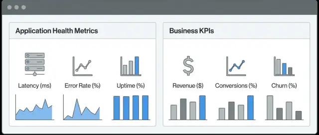
Technical metrics describe the behavior of your software and infrastructure. They answer questions like: Is the app responding? Is it erroring? Is it slow? Common examples include latency, error rate, throughput, CPU/memory usage, queue depth, and dependency availability.
Business metrics (KPIs) describe user and revenue outcomes. They answer questions like: Are users succeeding? Are we making money? Examples include sign-ups, activation rate, conversion, checkout completion, average order value, churn, refunds, and support ticket volume.
The goal isn’t to replace either category—it’s to link them, so a spike in 500 errors isn’t just “red on a chart,” but clearly connected to “checkout conversion dropped 12%.”
When health signals and KPIs share the same interface and time window, teams typically see:
This guide focuses on structure and decisions: how to define metrics, connect identifiers, store and query data, and present dashboards and alerts. It’s intentionally not tied to a specific vendor, so you can apply the approach whether you’re using off-the-shelf tools, building your own, or combining both.
If you try to track everything, you’ll end up with a dashboard nobody trusts. Start by deciding what the monitoring app needs to help you do under pressure: make fast, correct decisions during an incident and track progress week to week.
When something goes wrong, your dashboards should quickly answer:
If a chart doesn’t help answer one of these, it’s a candidate for removal.
Keep the core set small and consistent across teams. A good starting list:
These map well to common failure modes and are easy to alert on later.
Pick metrics that represent the customer funnel and revenue reality:
For each metric, define an owner, a definition/source of truth, and a review cadence (weekly or monthly). If nobody owns a metric, it will quietly become misleading—and your incident decisions will suffer.
If your health charts live in one tool and your business KPI dashboard lives in another, it’s easy to argue about “what happened” during an incident. Anchor monitoring around a few customer journeys where performance clearly affects outcomes.
Pick flows that directly drive revenue or retention, such as onboarding, search, checkout/payment, account login, or content publishing. For each journey, define the key steps and what “success” means.
Example (checkout):
Map the technical signals that most strongly influence each step. This is where application health monitoring becomes business-relevant.
For checkout, a leading indicator might be “payment API p95 latency,” while a lagging indicator is “checkout conversion rate.” Seeing both on one timeline makes the causal chain clearer.
A metric dictionary prevents confusion and “same KPI, different math” debates. For every metric, document:
Page views, raw signups, or “total sessions” can be noisy without context. Prefer metrics tied to decisions (completion rate, error budget burn, revenue per visit). Also deduplicate KPIs: one official definition beats three competing dashboards that disagree by 2%.
Before you write UI code, decide what you’re actually building. A “health + KPIs” app usually has five core components: collectors (metrics/logs/traces and product events), ingestion (queues/ETL/streaming), storage (time-series + warehouse), a data API (for consistent queries and permissions), and a UI (dashboards + drill-down). Alerting can be part of the UI, or delegated to an existing on-call system.
If you’re prototyping the UI and workflow quickly, a vibe-coding platform like Koder.ai can help you stand up a React-based dashboard shell with a Go + PostgreSQL backend from a chat-driven spec, then iterate on drill-down navigation and filters before committing to a full data platform rewrite.
Plan separate environments early: production data should not be mixed with staging/dev. Keep distinct project IDs, API keys, and storage buckets/tables. If you want “compare prod vs staging,” do it through a controlled view in the API—not by sharing raw pipelines.
A single pane doesn’t mean re-implementing every visualization. You can:
If you choose embedding, define a clear navigation standard (e.g., “from KPI card to trace view”) so users don’t feel bounced between tools.
Your dashboards will only be as trustworthy as the data behind them. Before you build pipelines, list the systems that already “know” what’s happening, then decide how often each one needs to be refreshed.
Start with the sources that explain reliability and performance:
A practical rule: treat health signals as near-real-time by default, because they drive alerts and incident response.
Business KPIs often live in tools owned by different teams:
Not every KPI needs second-by-second updates. Daily revenue can be batch; checkout conversion might need fresher data.
For each KPI, write down a simple latency expectation: “Updates every 1 minute,” “Hourly,” or “Next business day.” Then reflect that directly in the UI (for example: “Data as of 10:35 UTC”). This prevents false alarms and avoids arguments over “wrong” numbers that are simply delayed.
To connect a spike in errors to lost revenue, you need consistent IDs:
Define one “source of truth” for each identifier and ensure every system carries it (analytics events, logs, billing records). If systems use different keys, add a mapping table early—retroactive stitching is expensive and error-prone.
If you try to store everything in one database, you’ll usually end up with slow dashboards, expensive queries, or both. A cleaner approach is to treat app health telemetry and business KPIs as different data shapes with different read patterns.
Health metrics (latency, error rate, CPU, queue depth) are high-volume and queried by time range: “last 15 minutes,” “compare to yesterday,” “p95 by service.” A time-series database (or metrics backend) is optimized for fast rollups and range scans.
Keep tags/labels limited and consistent (service, env, region, endpoint group). Too many unique labels can explode cardinality and cost.
Business KPIs (signups, paid conversions, churn, revenue, orders) often need joins, backfills, and “as-of” reporting. A warehouse/lake is better for:
Your web app shouldn’t talk directly to both stores from the browser. Build a backend API that queries each store, enforces permissions, and returns a consistent schema. Typical pattern: health panels hit the time-series store; KPI panels hit the warehouse; drill-down endpoints may fetch both and merge by time window.
Set clear tiers:
Pre-aggregate common dashboard views (hourly/daily) so most users never trigger expensive “scan everything” queries.
Your UI will only be as usable as the API behind it. A good data API makes the common dashboard views fast and predictable, while still letting people click into detail without loading a totally different product.
Design endpoints that match the main navigation, not the underlying databases:
GET /api/dashboards and GET /api/dashboards/{id} to fetch saved layouts, chart definitions, and default filters.GET /api/metrics/timeseries for health and KPI charts with from, to, interval, timezone, and filters.GET /api/drilldowns (or /api/events/search) for “show me the underlying requests/orders/users” behind a chart segment.GET /api/filters for enumerations (regions, plans, environments) and to power typeaheads.Dashboards rarely need raw data; they need summaries:
Add caching for repeat requests (same dashboard, same time range) and enforce rate limits for wide queries. Consider separate limits for interactive drill-downs vs. scheduled refreshes.
Make charts comparable by always returning the same bucket boundaries and units: timestamps aligned to the chosen interval, explicit unit fields (ms, %, USD), and stable rounding rules. Consistency prevents confusing chart jumps when users change filters or compare environments.
A dashboard succeeds when it answers a question quickly: “Are we okay?” and “If not, where do I look next?” Design around decisions, not around everything you can measure.
Most teams do better with a few purposeful views than one mega-dashboard:
Put a single time picker at the top of every page, and keep it consistent. Add global filters people actually use—region, plan, platform, and maybe customer segment. The goal is to compare “US + iOS + Pro plan” to “EU + Web + Free” without rebuilding charts.
Include at least one correlation panel per page that overlays technical and business signals on the same time axis. For example:
This helps non-technical stakeholders see impact, and helps engineers prioritize fixes that protect outcomes.
Avoid clutter: fewer charts, larger fonts, clear labels. Every key chart should show thresholds (good / warning / bad) and the current status should be readable without hovering. If a metric doesn’t have an agreed good/bad range, it’s usually not ready for the homepage.
Monitoring is only useful when it drives the right action. Service Level Objectives (SLOs) help you define “good enough” in a way that matches user experience—and alerts help you react before customers notice.
Pick SLIs that users actually feel: errors, latency, and availability on key journeys like login, search, and payment—not internal metrics.
When possible, alert on symptoms of user impact before you alert on likely causes:
Cause alerts are still valuable, but symptom-based alerts reduce noise and focus the team on what customers are experiencing.
To connect health monitoring with business KPIs, add a small set of alerts that represent real revenue or growth risk, such as:
Tie each alert to an “expected action”: investigate, roll back, switch provider, or notify support.
Define severity levels and routing rules up front:
Make sure every alert answers: what is affected, how bad is it, and what should someone do next?
Mixing application health monitoring with a business KPI dashboard raises the stakes: one screen might show error rates next to revenue, churn, or customer names. If permissions and privacy are added late, you’ll either over-restrict the product (no one can use it) or over-expose data (a real risk).
Start by defining roles around decisions, not around org charts. For example:
Then implement least-privilege defaults: users should see the minimum data needed, and request broader access when justified.
Treat PII as a separate class of data with stricter handling:
If you must join observability signals to customer records, do it with stable, non-PII identifiers (tenant_id, account_id) and keep the mapping behind tighter access controls.
Teams lose trust when KPI formulas quietly change. Track:
Expose this as an audit log and attach it to key widgets.
If multiple teams or clients use the app, design for tenancy early: scoped tokens, tenant-aware queries, and strict isolation by default. It’s much easier than retrofitting after analytics integration and incident response are already live.
Testing an “app health + KPI” product isn’t only about whether charts load. It’s about whether people trust the numbers and can act on them quickly. Before anyone outside the team sees it, validate both correctness and speed under realistic conditions.
Treat your monitoring app like a first-class product with its own targets. Define baseline performance goals such as:
Run these tests with “realistic bad days” too—high-cardinality metrics, larger time ranges, and peak traffic windows.
A dashboard can look fine while the pipeline is silently failing. Add automated checks and surface them in an internal view:
These checks should fail loudly in staging so you don’t discover issues in production.
Create synthetic datasets that include edge cases: zeros, spikes, refunds, duplicated events, and timezone boundaries. Then replay real production traffic patterns (with identifiers anonymized) into staging to validate dashboards and alerts without risking customer impact.
For each core KPI, define a repeatable correctness routine:
If you can’t explain a number to a non-technical stakeholder in one minute, it’s not ready to ship.
A combined “health + KPIs” app only works if people trust it, use it, and keep it current. Treat rollout as a product launch: start small, prove value, and build habits.
Pick a single customer journey that everyone cares about (for example, checkout) and one backend service most responsible for it. For that thin slice, ship:
This “one journey + one service” approach makes it obvious what the app is for, and it keeps early debates about “which metrics matter” manageable.
Set a recurring 30–45 minute weekly review with product, support, and engineering. Keep it practical:
Treat unused dashboards as a signal to simplify. Treat noisy alerts as bugs.
Assign ownership (even if it’s shared) and run a lightweight checklist monthly:
Once the first slice is stable, expand to the next journey or service with the same pattern.
If you want implementation ideas and examples, browse /blog. If you’re evaluating build vs. buy, compare options and scope on /pricing.
If you want to accelerate the first working version (dashboard UI + API layer + auth), Koder.ai can be a pragmatic starting point—especially for teams that want a React frontend with a Go + PostgreSQL backend, plus the option to export source code when you’re ready to move it into your standard engineering workflow.
It’s a single workflow (usually one dashboard + drill-down experience) where you can see technical health signals (latency, errors, saturation) and business outcomes (conversion, revenue, churn) on the same timeline.
The goal is correlation: not just “something is broken,” but “checkout errors increased and conversion dropped,” so you can prioritize fixes by impact.
Because incidents are easier to triage when you can confirm customer impact immediately.
Instead of guessing whether a latency spike matters, you can validate it against KPIs like purchases/minute or activation rate and decide whether to page, roll back, or monitor.
Start with the incident questions:
Then pick 5–10 health metrics (availability, latency, error rate, saturation, traffic) and 5–10 KPIs (signups, activation, conversion, revenue, retention). Keep the homepage minimal.
Choose 3–5 critical journeys that map directly to revenue or retention (checkout/payment, login, onboarding, search, publishing).
For each journey, define:
This keeps dashboards aligned to outcomes instead of infrastructure trivia.
A metric dictionary prevents “same KPI, different math” problems. For each metric, document:
Treat unowned metrics as deprecated until someone maintains them.
If systems can’t share consistent identifiers, you can’t reliably connect errors to outcomes.
Standardize (and carry everywhere):
user_idaccount_id/org_idorder_id/invoice_idIf keys differ across tools, create a mapping table early; retroactive stitching is usually costly and inaccurate.
A practical split is:
Add a backend data API that queries both, enforces permissions, and returns consistent buckets/units to the UI.
Use this rule:
“Single pane” doesn’t require re-implementing everything.
Alert on symptoms of user impact first, then add cause alerts.
Good symptom alerts:
Add a small set of business-impact alerts (conversion drop, payment failures, orders/minute decline) with clear expected actions (investigate, roll back, switch provider, notify support).
Mixing revenue/KPIs with operational data raises privacy and trust risks.
Implement:
Prefer stable non-PII IDs (like account_id) for joins.