১৯ সেপ, ২০২৫·8 মিনিট
স্মার্ট নোটিফিকেশন ও রিমাইন্ডার মোবাইল অ্যাপ তৈরি: নির্দেশিকা
সময়োপযুক্ত, ব্যক্তিগতকৃত এবং ব্যবহারকারী-বান্ধব নোটিফিকেশন ও রিমাইন্ডার মোবাইল অ্যাপ কিভাবে পরিকল্পনা, তৈরী ও উন্নত করবেন — টাইমিং, পার্সোনালাইজেশন, UX প্যাটার্ন ও গোপনীয়তা।
What a Smart Notification App Should Do
A smart notification app isn’t “more notifications.” It’s fewer, better-timed nudges that help people finish something they already care about—without feeling interrupted.
Define what “smart” means
Before you design screens or pick tools, write a simple definition of “smart” for your product. A practical version is:
- Right time: send when the user can act (not during sleep, meetings, or commutes—unless they asked for it).
- Right message: short, specific, and action-oriented (“Pay electricity bill” beats “Reminder”).
- Right channel: local alerts, push notifications, SMS, email, or in-app banners—based on urgency and user preference.
If you can’t explain why a reminder is being sent now, it’s not smart yet.
The reminder types you should support (or consciously skip)
Most reminder apps start with one or two types and expand as they learn.
- Time-based reminders: “Tomorrow at 9am.” These are the foundation.
- Location-based reminders: “When I arrive at the grocery store.” Useful but permission-sensitive.
- Habit reminders: recurring nudges (“Every weekday at 8pm”). These need smart frequency controls to avoid fatigue.
- Task-based reminders: tied to a to-do item with a clear “done” action.
- Event reminders: synced to calendar events or one-time moments (tickets, appointments).
The key is consistency: each reminder type should have predictable behavior (snooze, reschedule, complete) so users trust the app.
Choose success metrics early
“Engagement” is vague. Pick metrics that reflect whether reminders are actually helpful:
- Opt-in rate: how many users allow notifications (and location, if applicable).
- Open rate / action rate: taps on a notification or direct actions (Done, Snooze).
- Completion rate: reminders that lead to completion within a window (e.g., 24 hours).
- Retention: whether users still create and complete reminders after 7/30 days.
These metrics will influence product decisions like default schedules, quiet hours, and copy.
Decide target platforms and scope
Pick iOS, Android, or cross-platform based on who you’re building for, not just developer convenience. Platform notification behaviors differ (permission prompts, delivery rules, grouping), so plan for those differences.
Clarify your app’s core promise
Write one sentence you could ship in an app store listing. Examples:
- “Set reminders that adapt to your schedule and only notify you when you can act.”
- “A reminder app that keeps you on track with gentle habits and one-tap completion.”
That sentence becomes your filter for feature requests: if it doesn’t strengthen the promise, it’s probably phase two.
User Needs, Use Cases, and Clear App Goals
A reminder app succeeds when it matches real routines—not when it offers more settings. Before choosing notification scheduling logic or designing push notifications, define who you’re helping, what they’re trying to accomplish, and what “success” looks like for them.
Key user groups to design for
Start with a small set of primary audiences, each with different constraints:
- Busy professionals who juggle meetings, deadlines, and travel time.
- Students who manage class schedules, study blocks, and assignment due dates.
- Caregivers who track meds, appointments, and shared responsibilities across family members.
These groups differ in tolerance for interruption, how often plans change, and whether they need shared reminders.
Map real-life scenarios (where reminders fail)
Collect scenarios that cause missed actions and turn them into concrete use cases:
- Missed medications because the reminder fired during a commute or a meeting.
- Bill due dates forgotten because the message arrived too early and got buried.
- Meetings missed because “leave now” depends on location and traffic.
- Daily routines (hydration, stretching, journaling) that fade without gentle, consistent prompts.
When you write these down, include context: time windows, location, typical device state (silent mode, low battery), and what the user did instead.
Write user stories that define “smart notifications”
Good user stories make your notification design decisions obvious:
- “Remind me when it’s 30 minutes before my meeting and I’m not already in another meeting.”
- “Don’t remind me during my focus hours, unless it’s marked urgent.”
- “If I ignore a reminder, nudge me again later—but stop after two tries.”
Choose the primary jobs-to-be-done
Keep the app goals simple and measurable. Most reminder apps serve four core jobs:
- Remember (surface the right item at the right moment).
- Plan (turn intentions into scheduled actions with minimal effort).
- Follow through (snooze, reschedule, and complete without friction).
- Reduce stress (fewer, better notifications—higher trust).
Decide your default behavior (to reduce setup)
Defaults shape outcomes more than advanced settings. Define a clear baseline: sensible quiet hours, a standard snooze duration, and a gentle escalation pattern. The goal is for users to create a reminder in seconds—and still feel the app is “smart” without constant tuning.
Core Features and Data Model for Reminders
A reminder app lives or dies by how quickly people can capture an intent (“remind me”) and trust it will fire at the right moment. Before you add “smart” logic, define the core reminder inputs, scheduling rules, and a clean data model that won’t paint you into a corner.
Pick reminder sources (how reminders get created)
Start with a few creation paths that match real behavior:
- Manual entry: a fast “title + time” flow with optional details.
- Calendar import: turn events into reminders (with clear mapping and easy opt-out).
- Email parsing: optional and permission-heavy; consider it later unless it’s core to your app.
- Templates: “Pay rent,” “Take meds,” “Weekly report,” etc., to reduce typing and improve consistency.
A good rule: each source should produce the same internal reminder object, not a separate type.
Define recurring logic (and the rules users will notice)
Recurring reminders often create the most support tickets. Make the rules explicit:
- Patterns: daily, weekly, monthly, custom intervals.
- Exceptions: skip a date, pause for a vacation, or “only weekdays.”
- Snooze rules: how long, how many times, and whether snoozing affects the series or just one occurrence.
- Time windows: “notify between 9am–6pm” or “avoid meetings,” if you support quiet hours.
Time zones and travel behavior
Choose a clear model and stick to it:
- Keep local time (e.g., “8am every day” adapts when the user travels).
- Fixed time (e.g., “8am New York time” stays anchored to one zone).
For non-technical users, label this as “Adjust when I travel” vs “Keep in home time zone.”
Offline behavior (trust even without connectivity)
People create reminders on the go. Ensure users can create/edit reminders offline, store changes locally, and sync later without losing edits. If conflicts happen, prefer “latest edit wins” plus a simple activity log.
A simple data model you can grow
Keep it lean, but structured:
- Reminder: id, title, notes, status (active/completed), createdAt.
- Schedule: nextTriggerAt, recurrenceRule, timeZoneMode, quietHours.
- Context: source (manual/calendar/template), optional tags, optional location.
- User preferences: default snooze duration, travel behavior, notification window.
This foundation makes later personalization easier—without forcing you to rebuild how reminders are stored and scheduled.
High-Level Architecture: Local vs Server Notifications
A reminder app can deliver alerts through a few channels, and your architecture should treat them as separate delivery paths. Most apps start with local notifications (scheduled on the device) and push notifications (sent from a server). Email/SMS can be optional add-ons for “can’t miss” reminders, but they introduce extra cost, compliance, and deliverability work.
Notification channels (what fires the reminder)
Local notifications are great for offline use and simple repeating reminders. They’re also fast to implement, but they can be limited by OS rules (battery optimizations, iOS limits on scheduled notifications).
Push notifications enable cross-device syncing, “smart” timing, and server-driven updates (e.g., cancel a reminder when a task is completed elsewhere). They depend on APNs/FCM reliability and require backend infrastructure.
Where the “smartness” lives
You have two main options:
- On-device rules: the app decides when to notify based on local data (habits, recent behavior, time zone). Pros: privacy, works offline. Cons: harder to experiment centrally and keep logic consistent across devices.
- Server-side scheduling: a backend computes the best time and sends pushes or creates schedules. Pros: A/B testing, global logic updates, multi-device consistency. Cons: more sensitive data handling and uptime requirements.
Many teams land on a hybrid: on-device fallback (basic reminders) + server-side optimization (smart nudges).
Essential backend services
At minimum, plan for authentication, a database for reminders/preferences, a job scheduler/queue for timed work, and analytics for delivery/open/completion events.
If you want to move quickly from product spec to a working prototype, a vibe-coding platform like Koder.ai can be useful for spinning up the core stack (React-based web surfaces, Go + PostgreSQL backend, and Flutter mobile clients) from a chat-driven build workflow—then iterating on notification logic as you learn.
Scalability planning
Expect traffic spikes around common reminder windows (morning routines, lunch breaks, evening wrap-up). Design your scheduler and push pipeline to handle bursty sends, retries, and rate limits.
Integrations to add later
Keep extension points for calendar sync, health/activity signals, and maps/location triggers—without making them required for the first release.
Permissions, Onboarding, and Opt-In Strategy
স্পেক থেকে অ্যাপে
একটি কথোপকথন থেকেই শেডিউলিং, অথেন্টিকেশন এবং ডাটাবেস স্কিমা তৈরি করুন, তারপর তা পরিমার্জন করুন।
A reminder app lives or dies by opt-in. If you ask for notification permission too early, many people will tap “Don’t Allow” and never revisit it. The goal is simple: show value first, then request the smallest permission set at the moment it’s clearly needed.
Onboarding: explain the “why” before the prompt
Start with a short onboarding that demonstrates outcomes, not features:
- “Never miss a bill payment”
- “Get a nudge when it’s the best time to work out”
- “Quiet hours so reminders don’t interrupt sleep”
Add a notification preview screen that shows exactly what a reminder will look like (title, body, timing, and what happens when tapped). This reduces surprise and increases trust.
Request permissions contextually (minimal first)
Request notification permission only after the user has created their first reminder (or enabled a key use case). Tie the request to an action:
- “Turn on notifications to get this reminder at 8:00 AM.”
Keep the initial ask minimal: notifications first, and only request extras when necessary (e.g., calendar access only if the user explicitly chooses “Sync with calendar”). On iOS and Android, avoid bundling multiple permission prompts back-to-back.
Give users real control
Provide preference controls directly in the app (not hidden in system settings):
- Quiet hours and days (weekday vs weekend)
- Priority (urgent vs normal)
- Channels/categories (e.g., Health, Bills, Work) and sounds
- Frequency rules (e.g., max reminders per day)
Make these reachable from the reminder creation screen and a dedicated Settings area.
Plan for “permission denied” gracefully
Document and implement fallback behavior:
- If notifications are denied, show in-app reminders (badge, inbox, or banner) and explain how to re-enable in system settings.
- Offer email/SMS alternatives only if they’re part of your product and consent is explicit.
- Detect disabled channels (Android) and guide the user to fix the specific channel, not just “turn on notifications.”
Notification UX: Content, Frequency, and Deep Links
Notification UX is where a “smart” reminder app either feels helpful or becomes background noise. Good UX is mostly about three things: saying the right thing, at the right pace, and taking the user to the right place.
Create a simple notification taxonomy
Start by naming the kinds of notifications your app will send. A clear taxonomy keeps copy consistent and helps you set different rules per type:
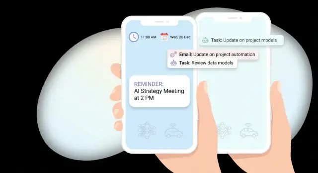
- Reminder: time-based (“Pay rent today”) or event-based (“Leave now to arrive by 3:00 PM”).
- Nudge: gentle prompt when a task is drifting (“Still want to finish your 10-minute stretch?”).
- Follow-up: after a partial action (“You started grocery list—add the last two items?”).
- Summary: batched digest (“3 tasks due today, 1 overdue”).
Write copy users understand in one glance
Great notification copy answers what, when, and what to do next—without making people open the app just to decode it.
Examples:
- “Water plants • Today 6:00 PM • Mark done or Snooze”
- “Submit expense report • Due in 2 hours • Review now”
Keep titles specific, avoid vague phrases (“Don’t forget!”), and use action buttons sparingly but predictably (e.g., Snooze, Complete, Reschedule).
Control frequency: caps, batching, and suppression
A smart reminder app should feel calm. Set defaults like a daily cap per notification type, and batch low-urgency items into summaries.
Also add “smart suppression” rules so you don’t spam:
- Don’t send a nudge if the user just opened the task.
- Pause reminders while the user is in Do Not Disturb / Focus modes (when supported).
- Stop repeating overdue alerts after a reasonable number, and offer a clear fix (“Reschedule?”).
Deep links that land on the exact screen
Every notification should open the user directly to the relevant task, not the home screen. Use deep links like:
- /tasks/123
- /tasks/123?action=reschedule
This reduces friction and increases completion.
Accessibility from day one
Use readable text (avoid tiny, dense content), support screen readers with meaningful labels, and ensure tap targets for notification actions are comfortable. If you support voice assistants or voice input, align wording with how people speak (“Snooze for 30 minutes”).
Making Notifications “Smart” with Personalization
“Smart” doesn’t have to mean complex AI. The goal is simple: send the right reminder, at a time and in a tone that makes completion more likely—without being annoying.
Start with rules and a simple score
Before machine learning, implement clear rules plus a lightweight scoring model. For each potential send time, calculate a score from a few signals (e.g., “user usually completes within 30 minutes,” “currently in a meeting,” “it’s late evening”). Pick the highest-scoring time inside an allowed window.
This approach is easier to explain, debug, and improve than a black-box model—and it still feels personalized.
Personalize using behavior you can observe
Good personalization often comes from patterns you already track:
- Typical completion time: If the user tends to complete a task at 8–9am, suggest that time as the default.
- Snooze patterns: If they always snooze by 15 minutes, offer “Snooze 15m” as the primary action.
- Location or routine context: If “Buy groceries” is usually completed near a store, consider suggesting reminders when they’re nearby (only with explicit opt-in).
Add context without being creepy
Context improves relevance when it’s obvious and respectful:
- Calendar busy status: Delay non-urgent reminders while the user is busy.
- Device focus modes / system DND: Don’t fight the OS—align with it.
- Time of day: Use softer nudges at night; hold low-priority reminders until morning.
Smart send windows and quiet hours
Implement smart send windows: instead of sending at a single timestamp, send within a user-approved range (e.g., 9–11am). Pair this with do-not-disturb periods (e.g., 10pm–7am) and allow per-reminder overrides for urgent items.
Explain it plainly and let users override
Tell users why a reminder moved: “We scheduled this for 9:30am because you usually complete similar tasks in the morning.” Include a quick control like “Send at original time” or “Always send at 8am.” Personalization should feel like a helpful assistant, not a hidden setting.
Reminder Flows: Create, Snooze, Reschedule, and Complete
সম্পূর্ণ স্ট্যাক তৈরি করুন
React, Go, PostgreSQL, এবং Flutter ব্যবহার করে এক জায়গায় ওয়েব, ব্যাকএন্ড এবং মোবাইল ক্লায়েন্ট তৈরি করুন।
A reminder app feels “smart” when the flow is effortless at the exact moment a user is busy. That means designing the full lifecycle: create → alert → act → update the schedule → close the loop.
Creating a reminder (fast, but structured)
Keep creation lightweight: title, time, and (optional) repeat rule. Everything else—notes, location, priority—should be additive, not required.
If you support recurring reminders, store the rule separately from each occurrence. This makes it easier to show “next occurrence” and prevents accidental duplication when users edit the schedule.
Acting from the notification: quick actions
Notifications should support quick actions so users can finish without opening the app:
- Mark done (completes the current occurrence)
- Snooze (delays once)
- Reschedule (moves to a new time)
- Skip (for recurring reminders—skips just this occurrence)
When a quick action changes the schedule, update the UI immediately and log it in the reminder history so users can understand what happened later.
Snooze and reschedule that don’t feel repetitive
Snooze should be one tap most of the time. Offer multiple presets (for example: 5 min, 15 min, 1 hour, tomorrow morning) plus a custom time picker for edge cases.
Reschedule is different from snooze: it’s a deliberate change. Provide a simple picker and smart suggestions (next free slot, typical completion time, “after my meeting”). Even without advanced personalization, “later today” and “tomorrow” shortcuts reduce friction.
A clean reminder detail page (with history)
When users open a reminder, show:
- The next occurrence (clearly)
- The rule or schedule summary (“Every weekday at 9:00”)
- A lightweight history (created, snoozed, rescheduled, completed, skipped)
This detail page is also the best place to undo mistakes.
Missed alerts: a notification center inbox
Push and local notifications get dismissed. Add an in-app Notification Center (an inbox) where missed reminders appear until resolved. Each item should support the same actions: done, snooze, reschedule.
Edge cases to handle early
Design for messy real life:
- Duplicates: prevent double-scheduling when saving edits or syncing
- Expired reminders: define what happens if the time has passed (deliver immediately, move to inbox, or mark missed)
- Rapid reschedules: debounce changes and keep the latest user intent as the source of truth
These decisions reduce confusion and make the app feel dependable.
Analytics, Experiments, and Iteration
Smart reminders aren’t “set and forget.” The fastest way to improve relevance (and reduce annoyance) is to treat notifications as a product surface you measure, test, and refine.
Instrument the right events
Start by logging a small set of events that map to the reminder lifecycle. Keep names consistent across iOS and Android so you can compare behavior.
Track at least:
- Permission status: prompted, granted, denied (and whether the user changed it later)
- Notification flow: scheduled, delivered, opened
- Outcome: reminder completed, snoozed, rescheduled, dismissed
Add context properties that explain why something happened: reminder type, scheduled time, user timezone, channel (local vs push), and whether it was triggered by a personalization rule.
Dashboards that answer product questions
Dashboards should help you decide what to build next, not just report vanity metrics. Useful views include:
- Opt-in funnel: install → permission prompt shown → granted
- Delivery health: scheduled vs delivered (and failure reasons)
- Engagement: open rate by reminder category and time window
- Completion: opened → completed conversion, plus time-to-complete
If you support deep links, measure the “open to intended screen” rate to spot broken routing.
Experiments without surprising users
A/B tests are ideal for timing windows and copy changes, but keep them respectful. User preferences (quiet hours, frequency caps, categories) should remain the higher priority.
Test ideas:
- Time window: 15 minutes before vs at time vs 10 minutes after
- Copy: direct vs supportive tone, shorter vs more specific
Feedback loops for “smart” behavior
When a user repeatedly snoozes or reschedules, that’s a signal. After a pattern (for example, three snoozes in a week), ask a lightweight question: “Was this helpful?” and offer one-tap fixes like “Change time” or “Reduce reminders.”
Cohorts and iteration cadence
Use cohort analysis to see what keeps users engaged: by reminder type, opt-in timing, or first-week completion rate. Review results on a regular cadence, ship small changes, and document what you learned so personalization rules evolve based on evidence—not assumptions.
Privacy, Security, and Compliance Basics
দ্রুত স্মার্ট রিমাইন্ডার প্রোটোটাইপ করুন
এই গাইডকে Koder.ai-এর চ্যাট-চালিত বিল্ড ফ্লো দিয়ে কাজ করা রিমাইন্ডার প্রোটোটাইপে পরিণত করুন।
Smart notifications can feel personal, which makes privacy and security non‑negotiable. The simplest way to reduce risk is to design your reminder app so it can deliver value with minimal personal data—and to be transparent about anything you do collect.
Collect only what you need
Start with a “need-to-know” mindset. If a reminder works without location, contacts, or calendar access, don’t ask for it. If you do need sensitive inputs (like location-based reminders), make them optional and clearly tied to a feature the user explicitly turned on.
A practical rule: if you can’t explain why you store a field in one sentence, remove it.
Be clear about data use (and put it where users look)
Explain data usage in two places:
- Onboarding permission prompts: short, feature-based (“Enable notifications to get your reminders on time”).
- Settings privacy section: fuller detail (“We store your device push token to deliver notifications; you can disable notifications anytime”).
Avoid vague language. State what you collect, why, and how long you keep it.
Secure storage, retention, and deletion
Push notifications require device tokens (APNs on iOS, FCM on Android). Treat tokens as sensitive identifiers:
- Store tokens and user data in encrypted storage (at rest) and use TLS (in transit).
- Lock down access (least-privilege roles, audited admin access).
- Define retention: keep only what supports reminders and analytics; set automatic deletion for old notification logs.
Plan for user-driven deletion from day one: deleting an account should remove personal data and invalidate push tokens.
Platform policies and user controls
Respect iOS/Android policies and consent requirements: no hidden tracking, no sending pushes without opt-in, and no misleading content.
Add user controls that build trust:
- Export data (basic portability)
- Delete account and notification history
- Limits for notification history/logs (e.g., last 30–90 days)
These basics make compliance easier later and prevent “smart” features from turning into user discomfort.
Testing, Launch Checklist, and Long-Term Improvements
Notifications are one of those features that can look perfect in a demo and still fail in real life. Treat testing and launch prep as part of the product, not a final hurdle.
Testing: delivery, timing, and edge cases
Start by validating delivery across multiple OS versions and manufacturers (especially on Android). Test the same reminder end-to-end with different device states:
- Idle and backgrounded app
- Low Power Mode / Battery Saver
- Do Not Disturb / Focus modes
- Poor network, airplane mode, and reconnect
Timing bugs are the fastest way to lose trust. Add explicit QA for:
- Time zones (travel scenarios)
- DST transitions (spring forward / fall back)
- Manual clock changes (user changes time, wrong system time)
- Locale formatting (12/24-hour time, language)
If you support recurring reminders, test “last day of month,” leap years, and “every weekday” logic.
Launch checklist: reduce surprises
Before release, prepare a simple checklist your team can reuse:
- App Store / Play assets: screenshots showing reminder flows, clear permission rationale
- Support docs: “Why didn’t I get a notification?”, “How to change reminder time,” and refund/contact paths
- Crash and performance monitoring with alerts (plus a way to tag notification-related sessions)
- Internal runbook: how to pause campaigns, disable a faulty template, or ship a hotfix
If you’re planning help with implementation or ongoing iteration, align expectations early on pages like /pricing.
Long-term improvements: earn engagement over time
Post-launch, focus on upgrades that reduce noise while increasing usefulness:
- More message templates tailored to context and tone
- Integrations (calendar, email, tasks) with clear opt-in
- Smarter batching to avoid multiple pings in a short window
If your team wants to keep iteration fast after v1, tools like Koder.ai can help you ship changes in smaller loops (UI, backend, and mobile) while still retaining the ability to export source code and deploy with custom domains—useful when notifications and scheduling logic evolve quickly.
For deeper guidance on content, frequency, and deep links, see /blog/notification-ux-best-practices.